WiSioux Posted July 14, 2016 Posted July 14, 2016 34 minutes ago, geaux_sioux said: fyp Don't put words in my mouth. Quote
geaux_sioux Posted July 14, 2016 Posted July 14, 2016 Just now, WiSioux said: Don't put words in my mouth. Read my next post captain sarcasm Quote
stoneySIOUX Posted July 14, 2016 Posted July 14, 2016 47 minutes ago, geaux_sioux said: That logo better go at center ice. We just won a national title in the first season as Fighting Hawks. The old logo was beautiful but cursed. 0 national titles to its name. I do think it's interesting that we won a national championship the last year we played with the geometric and the year after the last players who played with the Brien logo left. Quote
geaux_sioux Posted July 14, 2016 Posted July 14, 2016 Just now, stoneySIOUX said: I do think it's interesting that we won a national championship the last year we played with the geometric and the year after the last players who played with the Brien logo left. The Illuminati thought it was "interesting" as well Quote
stoneySIOUX Posted July 14, 2016 Posted July 14, 2016 1 minute ago, geaux_sioux said: The Illuminati thought it was "interesting" as well Lol I'm not saying I believe it, I just think it's pretty interesting that it happened that way. Quote
InHeavenThereIsNoBeer Posted July 14, 2016 Posted July 14, 2016 38 minutes ago, geaux_sioux said: With the ND and the North Dakota they treated the white as negative space and the red line poked out it certain spots. Obvious the racist logo was all solid so no red line inside it. No bites yet, surprising... trolling hard today 1 Quote
geaux_sioux Posted July 14, 2016 Posted July 14, 2016 12 minutes ago, InHeavenThereIsNoBeer said: No bites yet, surprising... trolling hard today It's not trolling. It's called humor. More people around here should give it a try. Quote
The Sicatoka Posted July 14, 2016 Posted July 14, 2016 32 minutes ago, geaux_sioux said: The Illuminati thought it was "interesting" as well Have we heard back from the Tri-Lateral Commission yet? Or do they have to have the %gobc sign off on their statement first? 1 Quote
tho0505 Posted July 14, 2016 Posted July 14, 2016 Your 2016-17 UND Roster http://www.undsports.com/SportSelect.dbml?&DB_OEM_ID=13500&SPID=6405&SPSID=58685 Quote
InHeavenThereIsNoBeer Posted July 14, 2016 Posted July 14, 2016 1 hour ago, geaux_sioux said: It's not trolling. It's called humor. More people around here should give it a try. Based on the response, you may not want to give up your day job. 1 Quote
I Ranger Posted July 14, 2016 Posted July 14, 2016 8 minutes ago, tho0505 said: Your 2016-17 UND Roster http://www.undsports.com/SportSelect.dbml?&DB_OEM_ID=13500&SPID=6405&SPSID=58685 Surprised and a little worried going into the year with only 14 forwards two of which are walk-ons in Gornall and Smith. Not a lot of depth. Quote
Siouxperfan7 Posted July 14, 2016 Posted July 14, 2016 13 minutes ago, tho0505 said: Your 2016-17 UND Roster http://www.undsports.com/SportSelect.dbml?&DB_OEM_ID=13500&SPID=6405&SPSID=58685 Boeser #16, Jost #17. The last time those two numbers were on the same line, it worked out well!! Quote
geaux_sioux Posted July 14, 2016 Posted July 14, 2016 14 minutes ago, InHeavenThereIsNoBeer said: Based on the response, you may not want to give up your day job. What day job? Quote
geaux_sioux Posted July 14, 2016 Posted July 14, 2016 5 minutes ago, Siouxperfan7 said: Boeser #16, Jost #17. The last time those two numbers were on the same line, it worked out well!! Could end up 16 - 17 - 19 Quote
GreenWing Posted July 14, 2016 Posted July 14, 2016 2 hours ago, stoneySIOUX said: I do think it's interesting that we won a national championship the last year we played with the geometric and the year after the last players who played with the Brien logo left. Actually we lost the championship game to BC that year Quote
stoneySIOUX Posted July 14, 2016 Posted July 14, 2016 37 minutes ago, GreenWing said: Actually we lost the championship game to BC that year We won it in 2000 without the Brien logo and lost in 2001 with it. That's what I was saying. EDIT: And I was wrong on that part. But, the new logo was used that season and that's when the "curse" started. Quote
geaux_sioux Posted July 14, 2016 Posted July 14, 2016 3 minutes ago, stoneySIOUX said: We won it in 2000 without the Brien logo and lost in 2001 with it. That's what I was saying. I think he's saying that the UNIs had the geometric on them. Quote
geaux_sioux Posted July 14, 2016 Posted July 14, 2016 1 minute ago, southpaw said: Boooooooooooooo 1 Quote
JTSchro Posted July 14, 2016 Posted July 14, 2016 5 minutes ago, southpaw said: It's hard to admit, but I am sloooowly warming up to the logo. I do think the D needs a little work still, as mentioned prior, but this isn't bad. Quote
Siouxperfan7 Posted July 14, 2016 Posted July 14, 2016 Emailed the Ralph general email box (fans@theralph.com) and inquired about how the new logo was going to be integrated at the Ralph, specifically at center ice. Here was the response I got; The new logo will be integrated into the game presentation for UND hockey games. The plan for the logo in the building is a work in progress, but fans will definitely notice it. Have a good afternoon. Garth Wiedrich Marketing Manager Ralph Engelstad Arena One Ralph Engelstad Arena Drive Grand Forks, ND 58203 (P) 701.777.0833 www.theralph.com Quote
bigskyvikes Posted July 14, 2016 Posted July 14, 2016 1 hour ago, I Ranger said: Surprised and a little worried going into the year with only 14 forwards two of which are walk-ons in Gornall and Smith. Not a lot of depth. Funny...I feel that roster has REPEAT written all over it! 2 Quote
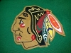
bigskyvikes Posted July 14, 2016 Posted July 14, 2016 10 minutes ago, JTSchro said: It's hard to admit, but I am sloooowly warming up to the logo. I do think the D needs a little work still, as mentioned prior, but this isn't bad. I have to admit I am also warming to it. The black outline and black feather tips got my attention. Quote
The Sicatoka Posted July 14, 2016 Posted July 14, 2016 1 hour ago, tho0505 said: Your 2016-17 UND Roster http://www.undsports.com/SportSelect.dbml?&DB_OEM_ID=13500&SPID=6405&SPSID=58685 They have Hoff at 5'8"? Everything I've seen before has him at 6' or so. And Yon wearing 7? I thought 7 was normally a scorer (sorry Zach). Quote
The Sicatoka Posted July 14, 2016 Posted July 14, 2016 2 minutes ago, bigskyvikes said: I have to admit I am also warming to it. The black outline and black feather tips got my attention. Doing an outline would allow them to clean up the top right of the "N" (to be more rectangular and not a triangle) and finish the "D" (to have an opening in the center instead of being a green blob). Quote
Recommended Posts
Join the conversation
You can post now and register later. If you have an account, sign in now to post with your account.