Boogieman Posted November 25, 2015 Posted November 25, 2015 We all remember when Kelley decided to have 3 names advance to the runoff and he said that the winner of that would be the nickname. The majority thought this was a horrible idea because the winner was sure to not have 50% of the vote. So what did we do? We emailed the people who make the decisions, voiced our concerns, and ultimately the process was changed to ensure a majority of at least 50% was required to select a new name.This issue required the same response. We do not need some outside firm from New York designing the new Fighting Hawks logo. There are plenty of local people with local ties to the University and the state that can come up with something that will be far superior to what a design firm out wast could come up with. Like I have said before, the last local guy with ties to the University designed a pretty good logo last time!!So voice your concerns to the appropriate people. You want to make a change in the process and make your voices heard? Contact the people who have a say in the matter. Let them know how UND's stakeholders feel. Give them a change to hear and possibly change their mind on the process It worked before, it can work again.As always, be respectful in your emails.robert.kelley@email.und.edupeter.johnson@email.und.eduHA! Mr. Kelley and Mr. Johnson couldn't give a Fighting Hawk's tail feathers what anyone thinks. I thought that was already established... Quote
Siouxperfan7 Posted November 26, 2015 Posted November 26, 2015 HA! Mr. Kelley and Mr. Johnson couldn't give a Fighting Hawk's tail feathers what anyone thinks. I thought that was already established...When I emailed in before about the winning name needing be at least a 50% majority, Peter Johnson replied back twice to my emails. These guys do read the emails they get. People voiced their opinion last time and they listened and changed the process. So they actually do care what people think. Quote
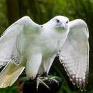
Chewey Posted November 26, 2015 Posted November 26, 2015 Welcome to the reality of "Fighting Hawks". It is what it is. I believe in truth and truth is conformity of mind to reality. Fighting Hawks is here and real. So, in the spirit of truth and reality, we have to go with it. And now we need a logo. OK, I get that some folks are rolling out their personal designs. Have at it. Here I'd like the conversation to focus on "What makes a great sports logo". The Capt. Obvious answer is a great team and winning tradition. Undoubtedly. The next is "the old logo". Sure, but in today's world that's not an option. (See above: truth.) So, moving beyond that, what else is there? I have some ideas of mine and others stolen from websites. I'd like to hear everyone's ideas on the concepts behind logos and not so much logo samples. Will we get into trouble with the NCAA because of the feathers on the bird logo? They are sacred to NA's after all.... Quote
KoolGuy2K Posted November 26, 2015 Posted November 26, 2015 Maybe we could use a thread on good chants, sayings or t-shirt ideas. For example, maybe a popular t-shirt for the masses that travel to out of town games, or to just describe our fan base might be a "Flawk of F'hawks". Or "Flawk of Fawks". :-)or F'hawk Kelley! 1 1 Quote
NoiseInsideMyHead Posted November 26, 2015 Posted November 26, 2015 or F'hawk Kelley!Get over it. He's gone. Show some class. 1 Quote
GreenWing Posted November 29, 2015 Posted November 29, 2015 My first notion: the simple, yet complex. The old Milwaukee Brewers glove logo. Or was it an "M", a "B", and a baseball? See that and other simple yet complex ideas here:http://ftw.usatoday.com/2014/07/sports-logos-hidden-images-milwaukee-brewers I just recently noticed the "H" in the Whalers logo. Mind was blown Quote
Siouxphan27 Posted November 29, 2015 Posted November 29, 2015 I just recently noticed the "H" in the Whalers logo. Mind was blownwow it's like the da Vinci code of logos! 1 Quote
batting500 Posted December 5, 2015 Posted December 5, 2015 Keep in mind that the logo is subject to NCAA approval, so I do not think this idea would work for that reason alone. But here goes...From Wikipedia "A tomahawk (also referred to as a hawk) is a type of single-handed axe from North America, traditionally resembling a hatchet with a straight shaft.[1][2]The name came into the English language in the 17th century as an adaptation of the Powhatan (Virginian Algonquian) word."What if the logo was the intercrossed ND with a pair of hawks above it, the hawks are unadorned by feathers, they are not primitive (not tied on by sinew) they are simple wooden shafts with a simple steel head.good luck all...batting500 Quote
ericpnelson Posted December 5, 2015 Posted December 5, 2015 Keep in mind that the logo is subject to NCAA approval, so I do not think this idea would work for that reason alone. But here goes...From Wikipedia "A tomahawk (also referred to as a hawk) is a type of single-handed axe from North America, traditionally resembling a hatchet with a straight shaft.[1][2]The name came into the English language in the 17th century as an adaptation of the Powhatan (Virginian Algonquian) word."What if the logo was the intercrossed ND with a pair of hawks above it, the hawks are unadorned by feathers, they are not primitive (not tied on by sinew) they are simple wooden shafts with a simple steel head.good luck all...batting500if we get to be a tomahawk, i'll run through a gauntlet of snowballs in front of the Ralph Quote
batting500 Posted December 5, 2015 Posted December 5, 2015 A crude attempt at art on my part...I will join you in your gauntlet run if this has any traction at all. BUT...looking into the history of using the word hawk for a hatchet it may have origins in 1350-1400 from "hache" Quote
dagies Posted December 5, 2015 Posted December 5, 2015 I'd prefer that association than with the bird. At least via image it would separate us from the rest of the flock 2 Quote
ericpnelson Posted December 5, 2015 Posted December 5, 2015 A crude attempt at art on my part...I will join you in your gauntlet run if this has any traction at all. BUT...looking into the history of using the word hawk for a hatchet it may have origins in 1350-1400 from "hache"again, i think it's as frivolous exercise as has ever existed, but I think a tomahawk version of the Virginia logo with the ND( V w/crossed swords beneath it) could be cool. Quote
darell1976 Posted December 6, 2015 Posted December 6, 2015 again, i think it's as frivolous exercise as has ever existed, but I think a tomahawk version of the Virginia logo with the ND( V w/crossed swords beneath it) could be cool. One scene of the Tomahawk Chop would end that logo very quickly. Quote
ArchyAlum11 Posted December 16, 2015 Posted December 16, 2015 How about this Idea, who says that we need to have a bird as our mascot? Both the P-36 and P-40 WWII fighter aircraft were nicknamed Hawk or some variation of hawk. We could do that and change it to a WWII aviation theme. The picture below is concept for Las Vegas's new NHL franchise, think that something similar could work well at UND. 1 Quote
Fetch Posted December 17, 2015 Posted December 17, 2015 He is kind of a Fighting Hawk http://uproxx.com/sports/2015/12/donald-trump-nfl-logos/ Quote
siouxfan512 Posted December 17, 2015 Posted December 17, 2015 On 11/23/2015 at 2:15 PM, The Sicatoka said: Welcome to the reality of "Fighting Hawks". It is what it is. I believe in truth and truth is conformity of mind to reality. Fighting Hawks is here and real. So, in the spirit of truth and reality, we have to go with it. And now we need a logo. OK, I get that some folks are rolling out their personal designs. Have at it. Here I'd like the conversation to focus on "What makes a great sports logo". The Capt. Obvious answer is a great team and winning tradition. Undoubtedly. The next is "the old logo". Sure, but in today's world that's not an option. (See above: truth.) So, moving beyond that, what else is there? I have some ideas of mine and others stolen from websites. I'd like to hear everyone's ideas on the concepts behind logos and not so much logo samples. First thought .... an sweet indian head moniker makes for a great sports logo Quote
johndahl Posted December 17, 2015 Posted December 17, 2015 Well, it shouldn't look like the logo of the other team with a hawk for a nickname in North Dakota... and, it shouldn't look like the logo of the other team with a hawk for a nickname in the NCHC... and it shouldn't look like the logos of the other couple teams in the Big Sky conference with generic-looking raptors as mascots... Did anybody do any research before deciding this would be a good idea for a nickname? 1 Quote
ArchyAlum11 Posted December 19, 2015 Posted December 19, 2015 On 11/24/2015 at 6:59 AM, NoiseInsideMyHead said: On 12/17/2015 at 4:56 PM, johndahl said: Well, it shouldn't look like the logo of the other team with a hawk for a nickname in North Dakota... and, it shouldn't look like the logo of the other team with a hawk for a nickname in the NCHC... and it shouldn't look like the logos of the other couple teams in the Big Sky conference with generic-looking raptors as mascots... Did anybody do any research before deciding this would be a good idea for a nickname? Exactly, what did this consulting firm do other than charge UND a lot of money? I think that for the final five the should have had some concept art done for the logo. Quote
choyt3 Posted December 21, 2015 Posted December 21, 2015 https://www.facebook.com/blaine.durward/posts/10153081898162574 1 Quote
sprig Posted December 21, 2015 Posted December 21, 2015 4 hours ago, choyt3 said: https://www.facebook.com/blaine.durward/posts/10153081898162574 I would probably buy something with that logo, someone needs to find the hidden element for me though? 1 Quote
Cratter Posted December 21, 2015 Posted December 21, 2015 Not bad. I like the gf star and subtle state of nd outline. 2 Quote
Siouxperfan7 Posted December 21, 2015 Posted December 21, 2015 58 minutes ago, Cratter said: Not bad. I like the gf star and subtle state of nd outline. Why is there a star pinpointing Hoople?!! Quote
Siouxperfan7 Posted December 21, 2015 Posted December 21, 2015 10 hours ago, choyt3 said: https://www.facebook.com/blaine.durward/posts/10153081898162574 Your old native american logo had feathers. This has feathers. Sorry, your new bird logo can't have any reference to feathers - NCAA logic Quote
Recommended Posts
Join the conversation
You can post now and register later. If you have an account, sign in now to post with your account.