
Frozen4sioux
-
Posts
5,472 -
Joined
-
Last visited
-
Days Won
21
Everything posted by Frozen4sioux
-
Next year. 2019-2020 Thome - Junior Scheel - Sophomore Rowe USHL Kaleb Johnson USHL or the 3rd goalie?? as "Bob" Anderson will have graduated. 2020 - 2021 Thome - leaves? or senior? Scheel - Junior Rowe - Freshman Johnson 3rd goalie? 2021 - 2022 Scheel - Senior Rowe - Sophomore Johnson - 3rd Goalie 2022 - 2023 Rowe - Junior Johnson Junior or senior 3rd goalie. I dont see a blue chip goalie waiting that long to be the #1 guy.... I wonder if.... I REALLY REALLY hope Thome and Scheel are that good that they both advance by leaving early after nattys.
-
With Tomek, you have to remember that he was injured, and that affected him greatly. He had his hips go bad on him between Phliiy dev camp and the season I believe. The handling of that injury was suspect but at the same time he developed a terrible team attitude and didnt develop a work ethic like he needed to recover, let alone compete. His world junior showing earned him a chance but ultimately, he just didnt fit. Hope for him he makes the best out of what he has available to him now..... but I would be very leary of recruiting oversees players, too many variables and due diligence is much more difficult.
-
Augie announces they are examining the move to DI
Frozen4sioux replied to Wildfan's topic in NCAA News
Schools competing at the highest level of their sport in the country. Thats it. If it was possible to compete nationally by any other sport on campus I'd be all for and support their participation at the "D1" level. -
North Dakota vs. Minnesota in Las Vegas - October 2018
Frozen4sioux replied to fargosioux's topic in Men's Hockey
Not to be a downer but ... if they toss a couple more stinkers against purple cow.... some fair weathers may think twice about dropping a few grand on a weekend in Vegas and dump tix cheap. Kinda what I’m counting on, wasn’t going o go due to other plans so gave tix away, now if I can get em cheap.... -
University of North Dakota 2018-19 Season
Frozen4sioux replied to Frozen4sioux's topic in Men's Hockey
I had heard about this awhile ago, thanks for the reminder. My dad has been able to get some nice seats theough this. Finally just signed up myslef. May donate a few times this year. -
University of North Dakota 2018-19 Season
Frozen4sioux replied to Frozen4sioux's topic in Men's Hockey
Facebook does have a ton of tire kickerz. Ss.com is easiest to deal with, never had a seller or buyer flake out through there. -
Yeah its been a real fun and successful decade hasnt it? Imagine my reluctance to degrading our flagship athletic program to such mediocre insignificance as well.... all in the hope to be slightly less mediocre in a slightly more prestigious but yet still insignificant tier... yeeeeeaaay......
-
North Dakota vs. Minnesota in Las Vegas - October 2018
Frozen4sioux replied to fargosioux's topic in Men's Hockey
was thinking the same... Was lo ok king from BIS Minot GF Fargo and MSP. MSP was the only real value around that 400ish, and that leaving on wednesday and returning ..... broke as hell... Monday. -
#Teambonding
-
Dont hate football, I attend football, have for over 30 years. I hate the waste of money on trying to be something its not, and the little bother jealousy complex the football only fools have with being as much like Fargo as the can, and the perverted need to destroy the history in order to create a parrallel reality. Football was fun, then it became a tale of keeping up to a world to which it didnt belong. Now give my damn #downvotedarrell...
-
Augie announces they are examining the move to DI
Frozen4sioux replied to Wildfan's topic in NCAA News
It is the old NCC... and thats fine...the stupidity lies in that its the same old thing at a 100x the cost. For what?.....a few letters that if say fast tries to convince ourselves we are part of the big boys club??? All these schools would have been better off to keep to the small pond that fits them and be happy winning DII championships. In reality, I dont consider a D1 FCS any higher than D2... its like being B1 or B ... good great but... Its not A...and these schools dont matter to the real A teams. Never will. -
Dude, get over it. You hate hockey. We get it. All the hate and rage in the world will never erase that image of those hockey players running a train on your gf back in the day, or whatever it is that triggered your chonicly obssesive jealous rage. Get back into therapy and just stop driving by the REA and filling your life with jealous hate.... ....with time, I promise it will all get better.
-
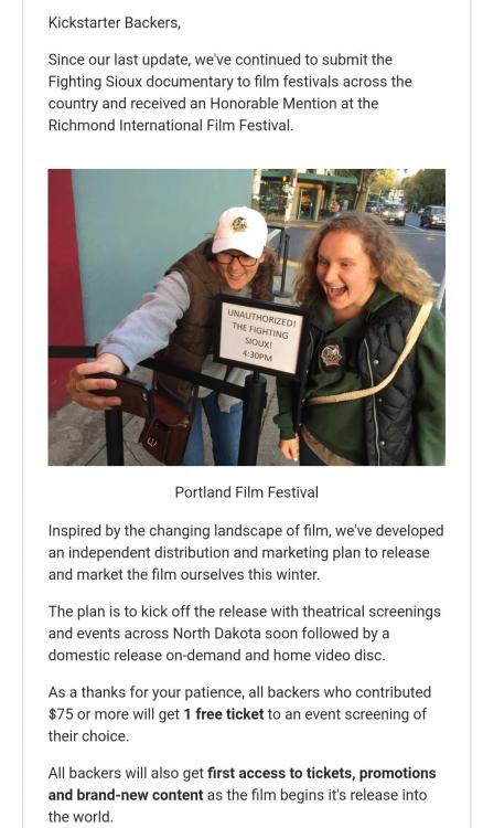
I'd say Netflix would be the pipedream. Overall I think this entire project was horribly mismanaged. As a backer I am quite disappointed in the process and execution, and hold little hope in being entertained or informed or inspired by the final product.
-
From a recent -October - email update
-
Gimme all the Brocks......
-
Mankato sweeps BU Minnesota is playing great vs UMD and thumpd a USTNDP that beat some teams Wisconsin sweeps BC Und ....OT for Manitoba and a 0-0-1 vs Bitchmidgee??? 0/8 on pp and 2/17 including the exhib. Thats the facts. Been a long time since we looked this tiger in the face.
-
'member when a kristo or a frattin would just create chances and finish.
-
On a good note anyone who wants to watch minnesota mankato duluth and air force in fargo may have a much easier ticket to find. Not the excitement needed going into regional ticket sales week.
-
Mankato Minnesota Wisconsin This continues..... from here it looks like a hail mary in the frozen faceoff will be needed.
-
Step one. Shaw has to go. PP this terrible can not continue. If BB doesnt hold his staff accountable the players dont hold themselves accountable.
-
need a leader to stand up... say screw it ill sit friday amd just sh!thouse a guy. No grit. soft..limp... #likeadarrell
-
Does being a douche come naturally or do you just have to work up to it throughout the day?.....
-
This powerplay .. again and again and again.... get puck on point..... delay until box shifts to that sector... fire puck into mess. blocked.
-
When and if they establish control they move the puck around the umbrella and then play it for a shot on the strong side... Successful powerplays in college hockey move the puck down to the weak side and then backdoor. have no idea the thought process of continually trying to establish scoring attempts to stacked and clogged sections of the ice.. Spread it around for gods sake
-
Its cute you think a sub division title is equal. Like posting a kids C squad trophy allnover facedbook


