GeauxSioux
-
Posts
5,645 -
Joined
-
Last visited
-
Days Won
15
Everything posted by GeauxSioux
-
I was reading a piece on The Verge about laptops versus note taking and a Youtube video near the bottom of the page with someone in a space suit with a UND logo on it caught my eye.
-
My kids all bought t-shirts. Some said Fighting Hawks and some just said North Dakota. They were sad to see Fighting Sioux gone, but we have moved on.
-
Fitted. Got it at Sheels for about $20.
-
Went to GF and had to buy a hat.

-
If you have enough people that you would need two hotel rooms, this works better for us. The deposit gets reimbursed, so the only thing you are looking at is the standard rate plus tax and the cleaning fee.
-
Since the first VRBO that we went to was booked for our recent visit to GF, we stayed at a new one in the Aspen Lofts. Great place and has an amenities building. We were so busy that we didn't get to take advantage of that part, but the unit was great. If you are going to stay in GF for a few nights, I recommend this place. https://www.vrbo.com/999868
-
-
Need Northern Colorado.
-
i didn't know that. I am going to GF later this summer. I will have to check it out.
-
Since I have not lived in Grand Forks for about 25 years, I had to pull up Google Maps/Street to get an idea of where all of this was. i don't know the names of all these little pocket parks, but I now know where Arbor Park is. If Google Street is any indication on the popularity of the park, I would say it is dead. There is no one in it. Granted I don't know what time the picture was taken, but the coffee shop at the corner seemed to have some business and the park next to the coffee shop (where Benners, the greatest hobby shop in history used to be) had people sitting in it. So we are talking about a downtown park that, from the sounds of it, is under utilized, being turned into a mixed use development project; while there is acres of park by the river two blocks away. I think most cities would love to have something similar to the Greenway. Pocket parks are nice, but you need development, as well.
-
http://abcnews.go.com/ Nashville is a great and beautiful city and it sounds like America is finding that out.
-
Was it like this.... ?
-
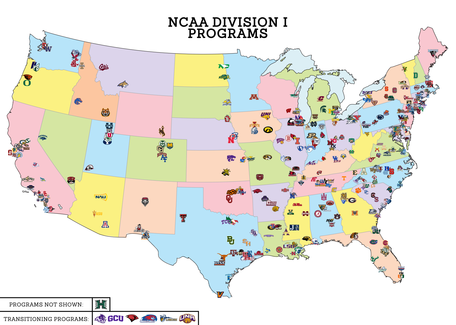
Someone posted this map over at http://csnbbs.com/thread-818307.html Really gives some perspective on the great divide between east and west. I still say, if Douple is wise, he will be thinking about getting UNC and starting Summit football. It would protect the autobids and solidify the conference. I also believe that UNI would jump ship at some point and join the Summit. It would not happen for a while, due to the money and perceived strength in the MVC, but they will come. UNC gets beat up on a lot of the forums for under performing since transitioning to Division I. Maybe what they need is to get back with their old NCC buddies. While Greeley is often put down, it is a growing metro with potential. I am in construction and do projects with Hensel Phelps, one of the larger general contractors in the country, and they are based in Greeley.

-
I went to the US Education OCR website to review any similar cases to UND. Typing hockey into the search, the first hit was Merrimack college. Here are the findings of the complaint... https://www2.ed.gov/about/offices/list/ocr/docs/investigations/01106001-a.pdf Merrimack had a student population of 52.6% men, 47.4% women and athletic opportunities at 65.2% men and 34.8% women. This reflected as a significant disparity (12.6%) and Merrimack agreed to the following.... https://www2.ed.gov/about/offices/list/ocr/docs/investigations/01106001-b.pdf I don't believe they will find a "significant disparity" at UND. I am thankful that Kennedy/Faison had the foresight to get legal representation on board from the beginning.
-
- 1
-

-
There was a time about 10-12 years ago that the FU fans were envious of UND tailgating. Time to make that happen again.
-
Didn't there used to be a Valley Dairy in 314 Cambridge. My sister used to have nicknames for all of the Valley Dairy locations... Carton Dairy, Mission Dairy.. She called this location Alley Dairy.
-
Why is this any of our business? Let him play football and get an education without questioning his motives.
-
What are UND's obligations moving forward in regards to the Summit and MVFC? Has UND signed papers obligating UND to those conferences legally? Has UND made payments? If the Summit blows up, can UND fall back to the Big Sky?
-
Hutchison's Kelley Ragan signs with University of North Dakota I love this part...
-
To maintain the basketball autobid, you will need to bring in another baseball playing school to replace Omaha. That is why on a recent post I advocated bringing in Northern Colorado. They could be travel partners with Denver. Although, I honestly don't know much about the relationship between UNC and Denver. Bringing in UNC also provides 6 schools paying football, which would allow for Summit football in the future.
-
I started a thread about that topic over on egriz... http://egriz.com/grizboard/viewtopic.php?f=1&t=76379
-
With an I-29 based conference, maybe they can go back to calling it the Mid Continent Conference. I never have cared for the name Summit League. It sounds like a women's over 60 Tuesday night bowling league.
-
if I were Douple, looking at the long term health of the conference, I would be exploring Summit football. If the rumors are true about Murray going to the MVC, is it possible that WIU would go to the OVC, as Murray's replacement? The conference has taken a shift westward, leaving WIU on an island of sorts. An island somewhat closer to the OVC footprint, Then you have the Indiana alphabet schools. Fort Wayne plays baseball. Could they be plucked by the Horizon? You need 6 for baseball and If WIU or Ft. Wayne leaves, you only have 5.
-