GeauxSioux
-
Posts
5,645 -
Joined
-
Last visited
-
Days Won
15
Everything posted by GeauxSioux
-
With Sioux Falls becoming more of a hockey town with the Stampede, expanding the "Fighting Hawk" brand into Yote/Bunny territory is a good thing. Put the regional in Sioux Falls a few times, more Hawk fans.
-
As I see it.... 1. UND is not part of the current MVC expansion conversation, nor should they be. 2. It would not be good for UND, if one or more of the other Dakota schools left the Summit, with UND just joining to cut travel expenses. 3. SDSU is the most attractive of the Dakota schools for potential membership, due to combination of geography, facilities and basketball history for both the men's and women's programs.
-
-
And Omaha.
-
And add the Montanas. They see the Big Sky as a sinking ship anyway, according to their forums.
-
As I said last week, if you add UNC, you then have 6 schools playing football. You could start Summit football.
-
I would think that SDSU would be a more attractive choice than NDSU. They have a better overall basketball history and have a good women's basketball program to boot. Also better geographically. I know that they have the Summit tournament in their backyard and that would play into any decisions, but I can't imagine that if the MVC asked, SDSU would say no.
-
Not to pile on here, but there is no interest in Women's Hockey at UND. This is a Box score from a playoff game. Attendance 210. That does not generate enough money to turn the lights on. My kid's church league soccer games gets better attendance than that. I can almost say it would be "okay" if they lost money and there was a following and interest. It just isn't there. Okay, yes, I am piling on.
-
The ladies had a nice sweep of SDSU (6-0, 4-3) this week to get back on the winning track. Congrats!
-
I had not heard of the dire budget problems in Nebraska before. “We could close the University of Nebraska [at] Kearney and still have to find $10 million,” said University of Nebraska President Hank Bounds.
-
I will preface this by saying that I never have been a fan of the Summit, but that is where UND is going unless something huge changes, so I am looking at the potential impacts for UND. Looking at the landscape when Wichita vacates the MVC, who takes their place and what other moves are made? Some have said Omaha is a potential choice for the MVC due to location and market. If Omaha leaves the Summit, the Summit is once again down to 5 schools playing baseball. Not good for BB auto-bid. So who does the Summit bring in for baseball for the 6th team? Northern Colorado? They could be Denver's travel partner. I know the MVFC fans won't like this next part. If UNC is brought in as the 6th school for baseball, they bring football, which will mean the Summit will have 6 for football. Summit football anyone?
-
MplsBison had these numbers on another forum. For UND (2015-16 reported data): Full-time undergrad enrollment: Male - 4902 (54%) Female - 4159 (46%)
-

President Kennedy Message on Athletics
GeauxSioux replied to fightingsioux4life's topic in Other Sports
Turn UND into a lean mean fighting machine... -
President Kennedy Message on Athletics
GeauxSioux replied to fightingsioux4life's topic in Other Sports
Maybe the recruiting trip he is on is not for new players, but for a new job for himself. -
President Kennedy Message on Athletics
GeauxSioux replied to fightingsioux4life's topic in Other Sports
Jai alai is more fun, since you can bet on it. -
President Kennedy Message on Athletics
GeauxSioux replied to fightingsioux4life's topic in Other Sports
You need to be thinking not only Title IX, but also core sports. The only sports you mention cutting are women's sports. Not good for Title IX. If you want to stay in the Big Sky, you cannot cut women's golf. It is a core sport. Also, cutting just these two sports isn't likely going to cut $1.4M, which is the current hole in the department. As said before, one of the biggest drains to the department is women's hockey and should be the first to go. Women's hockey has been a varsity sport for only about 15 years. UND/Grand Forks was a hockey community before women's hockey and will continue to be without women's hockey. If additional cuts are needed, I would look at M/W Swimming. Yes, UND has the facilities, but as I mentioned in a previous post, UND had talked of replacing the pool facilities by 2015. We are already a year past that and I doubt that there is a change in sentiment regarding the adequacy of facilities. Cutting Whcky and M/W S/D would get UND down to 16 sports. To keep Title IX compliant, I would keep softball and soccer. Soccer is played by kids of all age groups all across America, and the world for that matter. In regards to softball, UND has 18 home games this year. Yes they do play more away games, through tournament and invitationals, but I would keep it and have a nice round 16 sports.- 2,150 replies
-
- 4
-

-
- budget shortfall
- restructuring
- (and 1 more)
-
President Kennedy Message on Athletics
GeauxSioux replied to fightingsioux4life's topic in Other Sports
It hit me a while after posting earlier that his name was Neil. I found this picture linked to this site. Sorry for the thread drift. -
President Kennedy Message on Athletics
GeauxSioux replied to fightingsioux4life's topic in Other Sports
Wasn't there a Whalen who played goalie for GFC back in the 70's. -
President Kennedy Message on Athletics
GeauxSioux replied to fightingsioux4life's topic in Other Sports
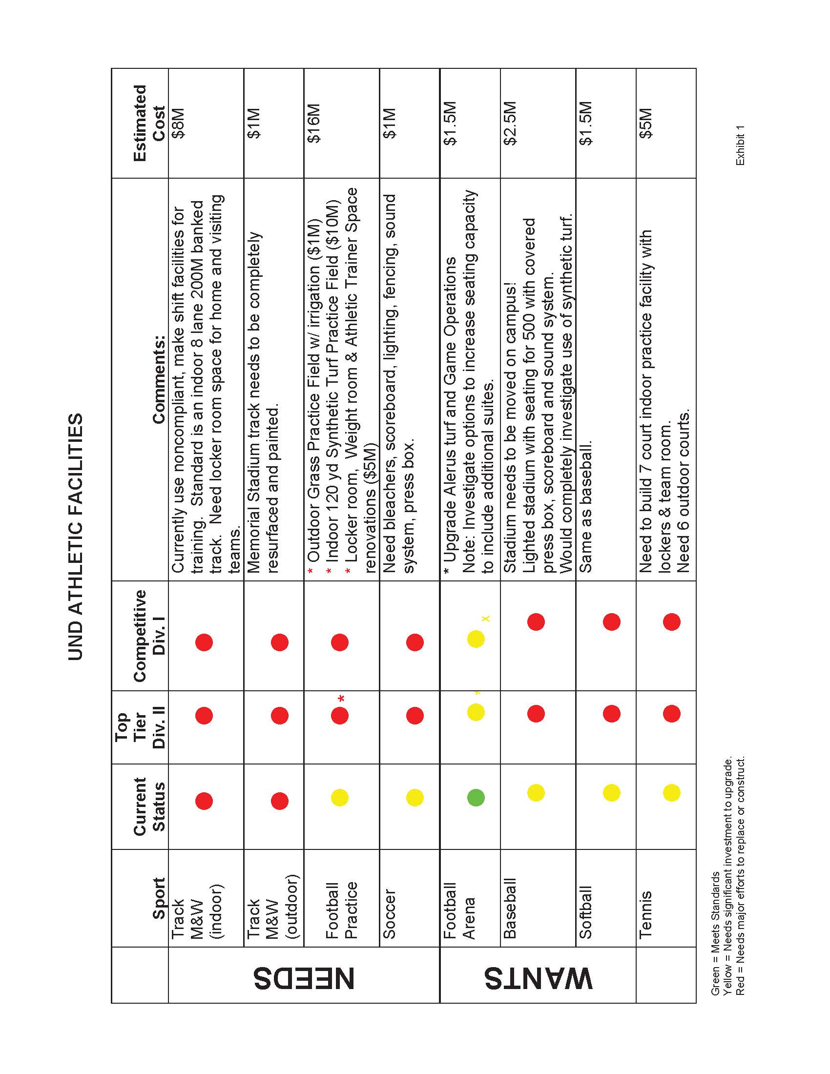
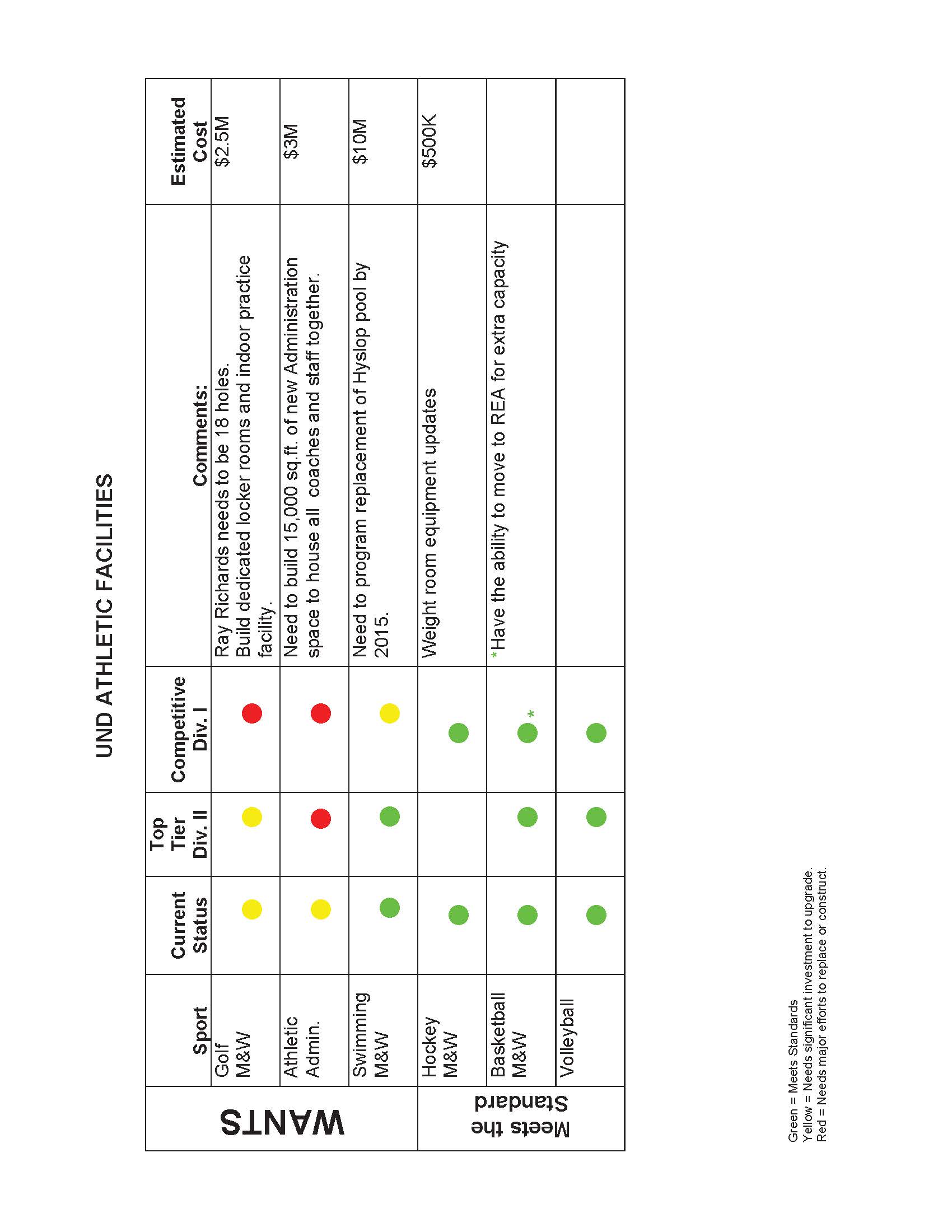
Part of this equation is facilities, near term and long term. The attached was part of UND's reclassification analysis. UND at some point will need to upgrade the swimming facilities. Big $$.

-
President Kennedy Message on Athletics
GeauxSioux replied to fightingsioux4life's topic in Other Sports
NLI dates -
President Kennedy Message on Athletics
GeauxSioux replied to fightingsioux4life's topic in Other Sports
How do the big time FBS schools like Alabama handle this situation? Looking at the Alabama website they have about 3 more sports than men's sports. And I'm sure there are a lot more perks/better facilities for the football than there is for anything else at Alabama. If women's hockey was scrapped at UND, the women would still have two more sports than the men, 10-8. If cutting women's hockey is saving money above and beyond the shortfall, money (scholarships) could be reallocated to other women's sports, such as soccer or softball. If UND is really trying to get a handle on the athletic budget, cutting a little bit of the fat here and there isn't going to do it. Women's hockey is the most obvious choice for a serious cut.- 2,150 replies
-
- 1
-
-
- budget shortfall
- restructuring
- (and 1 more)
-
President Kennedy Message on Athletics
GeauxSioux replied to fightingsioux4life's topic in Other Sports
I was just typing the same thing. You beat me to it.- 2,150 replies
-
- 1
-
-
- budget shortfall
- restructuring
- (and 1 more)
-
President Kennedy Message on Athletics
GeauxSioux replied to fightingsioux4life's topic in Other Sports
If "everything" is on the table, I would be eyeing Women's Hockey. I believe Idalski's contract is up on the end of this season, coincidentally. Since UND has already cut two men's sports, cutting one women's sport wouldn't be earth shattering. The costs associated with women's hockey have to be quite large in comparison to some of the other sports being mentioned for cuts. Would cutting baseball, men's golf and women's hockey get to the $1.4M or would more need to be cut? Edit: Additionally, the most recent comments seem to dwell more on the sports that will be discontinued than on conference affiliation. -
President Kennedy Message on Athletics
GeauxSioux replied to fightingsioux4life's topic in Other Sports
-
I first heard Jim Rome on the radio about ten years ago while on the road for work. I listened to it for about half an hour and had to turn it off, as it had to be one of the stupidest shows I had ever heard. "Clones" calling in with their "take". Rome saying the same thing over and over again for 5-10 minutes, trying to sound intelligent. I ran some errands yesterday, station surfing, and heard him on the radio talking about the kid from FSU that killed two people and was likely on some drugs. Rome spent five minutes talking about it, saying since the kid was not an athlete he wasn't going to talk about it. How is this man still on the radio? Who listens to him? Maybe I am just too old and not enough of a sports nut, but I just don't get the appeal of Jim Rome's show.