Siouxperfan7
-
Posts
6,864 -
Joined
-
Last visited
-
Days Won
97
Everything posted by Siouxperfan7
-
Funny you say that. How has it gone for you? Let me tell you because it seems that you have obviously forgotten. In the last 4 years since USD has joined the MVFC, the Yotes are 1-7 against NDSU/SDSU with the lone victory coming last year in Fargo. If that isn't bad enough, here are the results of those 7 loses. 2012 NDSU 54 - USD 0 - SDSU 31 - USD 8 2013 NDSU 42 - USD 0 - SDSU 27 - USD 12 2014 NDSU 47 - USD 7 - SDSU 37 - USD 14 2015 SDSU 30 - USD 23 Thats 57 points for, 268 points against in those 7 games for those scoring at home. And furthermore, you are a combined 12-34 (6-26 conference record) since joining the MVFC. So yeah, I think this is the same USD program I grew up with! You talk a big game cause you are in the MVFC, but you an average to bottom dweller team the last 4 years. You are the Vanderbilt of the MVFC Darn those pesky facts and stats. I hope you don't get angry about them and go trash a locker room over it.
-
That seems like the logical solution, but unfortunately that may not even work. Look at student attendance at the Ralph the last couple years. We have been a Frozen Four and National Championship team for the past 3 years and they took away an entire section of the students seats in the upper bowl!! Winning should solve attendance issues, but it may be more than that.
-
Wait, so a Coyote fan comes on to a UND website, makes sarcastic comments and comes off as smug, arrogant and cocky and is expecting to be treated with class and respect when he comes in and acts the same way when he walks into the tailgate lot and stadium of an opposing fanbase? Um...ok!!
-
#fireJones #hireWalthall
-
Sorry to change topics, but I haven't heard anything about a contract extension for Jones. Is he not in his last year of his contract? Would be odd to have a head coach go into a season on his last year of his contract.
-
Just build a stadium with the ETFE roof like US Bank Stadium. Outdoor feel with indoor temps!!
-
University of North Dakota Hockey 2016 - 2017 Season
Siouxperfan7 replied to Frozen4sioux's topic in Men's Hockey
Gopher fans can spell? -
White helmet?
-
Only thing is that the locker room vandalism happened in 2011. None of the coaches or players were around for that. So it is likely none of them would know what the heck you are talking about.
-
If they are busting out the grey, they are doing all grey. And by that I mean grey helmets as well. You heard it hear here first. UND will run out of the tunnel this Saturday wearing grey pants, grey jerseys, and grey helmets!! (of course I have no factual basis on this prediction, but that's neither here nor there)
-
I did send an email to the Ralph asking them why there wasn't a Fighting Hawks logo at center ice this year, and they gave me the "we didn't have enough time to get a new stencil created" line. I guess 2 months is not enough time. However, I did follow up by asking them if they planned on putting it on center ice for next season and the response I got was: So I guess the decision on the center ice logo isn't made by Jody Hodgson or anyone else at the Ralph. It is made by Brian Faison.
-
#notgonnahappen
-
Fighting Abdominal Snowman would have won in a landslide!
-
Couldn't agree with you more. Especially on the bolded point. Not a bad first post! Hopefully you didn't set the bar too high!!
-
Really not that much difference. I say we get over 10,000. But not by much.
-
I know that it would have cost a whole lot more money and it is unprecedented in cases like this, but the ideal way to pick the new name and logo would be for a company like SME develop a logo for each of the 5 finalists (Fighting Hawks, Roughriders, Nodaks, Sundogs, and North Stars) and have the public vote. That way we know the finished product of what we are voting for. Obviously was not gonna happen that way, but certainly would have been better.
-
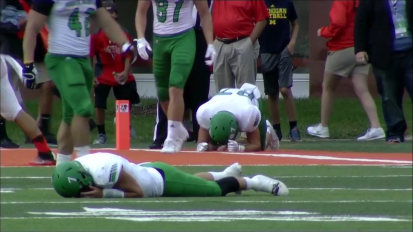
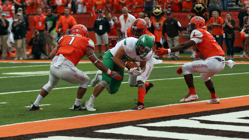
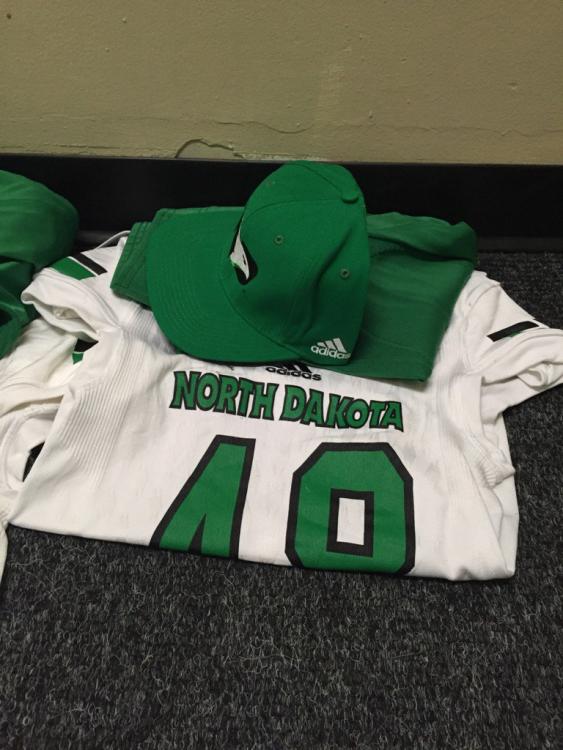
The game Saturday obviously didn't end the way all of us wanted. But on a side note, I did like the look of the green pants/white jersey/green helmet look we went with for the game. Looked good. Much better than the white pants/white jersey we have previously gone with on the road.
-
Not sure what people were expecting for a logo when a non original name was chosen. Unfortunately SME wasn't given alot to work with in regards to originality. If they would have came out with a generic bird that looks like the other bird logos out there, only difference being ours would be green, white, and black, would that have been better? SME developed a logo that is very unique in regards to college logos. I can't think of any logo in college (or other sports team for that matter) that integrates the letters of the state with the name of the team the way they did it with the Fighting Hawks. Given what they had to work with for a name, they really did a pretty good job. I am glad we didn't just get another generic bird logo.
-
pretty much sums it up.

-
Given the generic name that SME had to work with, I am glad that they didn't come up with just another generic bird logo. Put all the college bird logos in a line, and they all are the same. At least with the Fighting Hawks logo, you have something unique and not seen before in college athletic logos.
-
The Betty Needs a Video Board (or two)
Siouxperfan7 replied to niouxsiouxfan's topic in Men's Basketball
I saw on twitter that they updated the north wall of the Betty with all the logos with the new Fighting Hawks logo. Anyone seen it or have pics? -
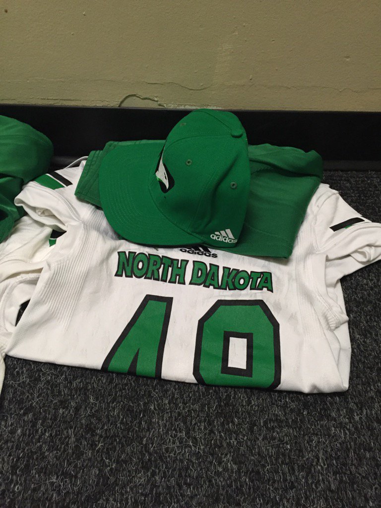
Now that hat looks good!! I'd buy that.
-
There is going to be Fighting Hawk merchandise that looks bad. Can be said for a lot of sports merchandise. Sometimes the logo just isn't portrayed well on the article of clothing being sold. I am sure there was some Fighting Sioux merchandise that looked bad that no one wanted to buy.
-
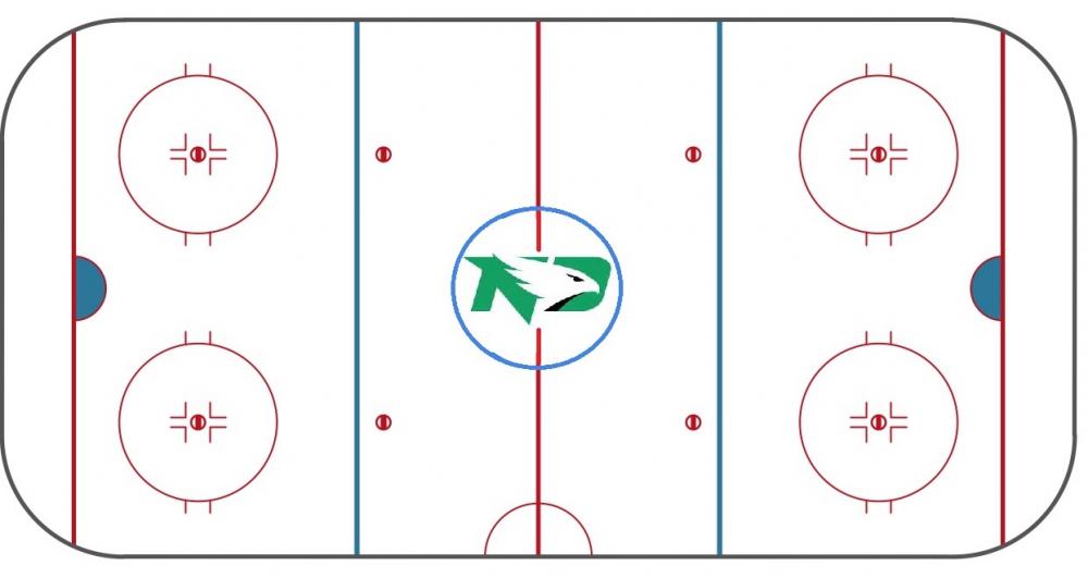
Hopefully the ice at the Ralph looks similar to this next year!!
-
The N and the D are formed as a result of the hawk in front of it. Sure they could have done block lettering with a hawk head in front of it, but SME made a logo where the hawk actually forms the letters N and D. That is what makes this logo unique from the other bird logos out there (or any other for that matter).