Siouxperfan7
-
Posts
6,864 -
Joined
-
Last visited
-
Days Won
97
Everything posted by Siouxperfan7
-
Well I guess you can't say that our new logo isn't unique. Its the only logo out there that can't be reversed and can only be viewed in one direction!!
-
North Dakota vs. Minnesota in Las Vegas - October 2018
Siouxperfan7 replied to fargosioux's topic in Men's Hockey
Same sort of deal that UND fans are getting letting Champions Club members get tickets before they go on sale to the general public. They are reserving a small amount of tickets for Gopher fans to get tickets. -
Goal9 (trademarked by Siouxperfan7. All rights reserved)
-
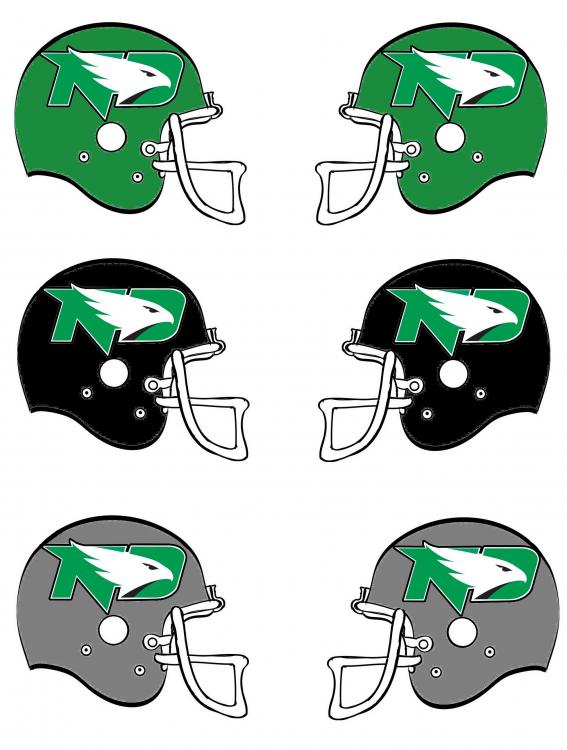
Obviously a little late for this discussion, but it is unfortunate that SME didn't take the existing interlocking ND logo and modify it by adding a hawk to it. Would have been a great way to link the past to the future. This type of logo is certainly not something new. We have all seen them before.
-
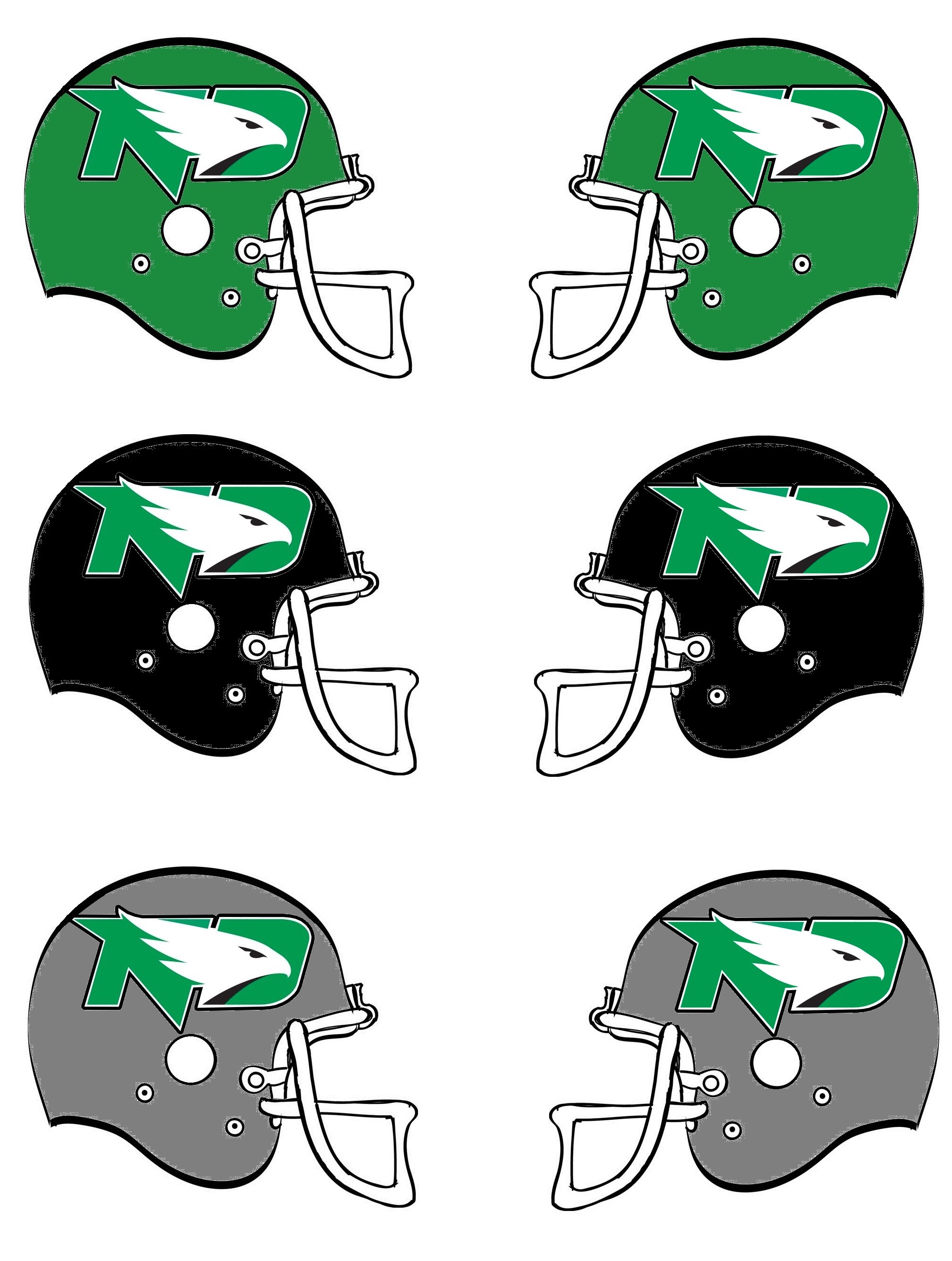
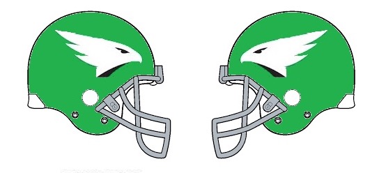
Having logos on both sides doesn't look that bad. Sure, the hawk is facing backwards. But it's not horrible. is it? I'm cool with the logo on 1 side. As long as they do numbers on the other.
-
I do like that the new gray pants have the green stripe down the side. Gray pants with the green jersey and the gray helmets would be pretty sharp. Not a fan at all of using 1 color for the pants/jersey/helmet. With 3 colors, we can mix it up.
-
It does seem strange that there are pictures of the gray helmet even dating back to last spring, but Bubba said that it will not be an option for this year. I am thinking his "You never know where this goes" comment is a hint that the gray helmets will be used this year. My guess is the Potato Bowl game against USD to go along with thhe new gray jerseys. Just a hunch, but we will see I guess.
-
Other options.....

-

-
University of North Dakota Hockey 2016 - 2017 Season
Siouxperfan7 replied to Frozen4sioux's topic in Men's Hockey
Imagine every time someone on that line scores a goal.....they blast this song at the Ralph!! -
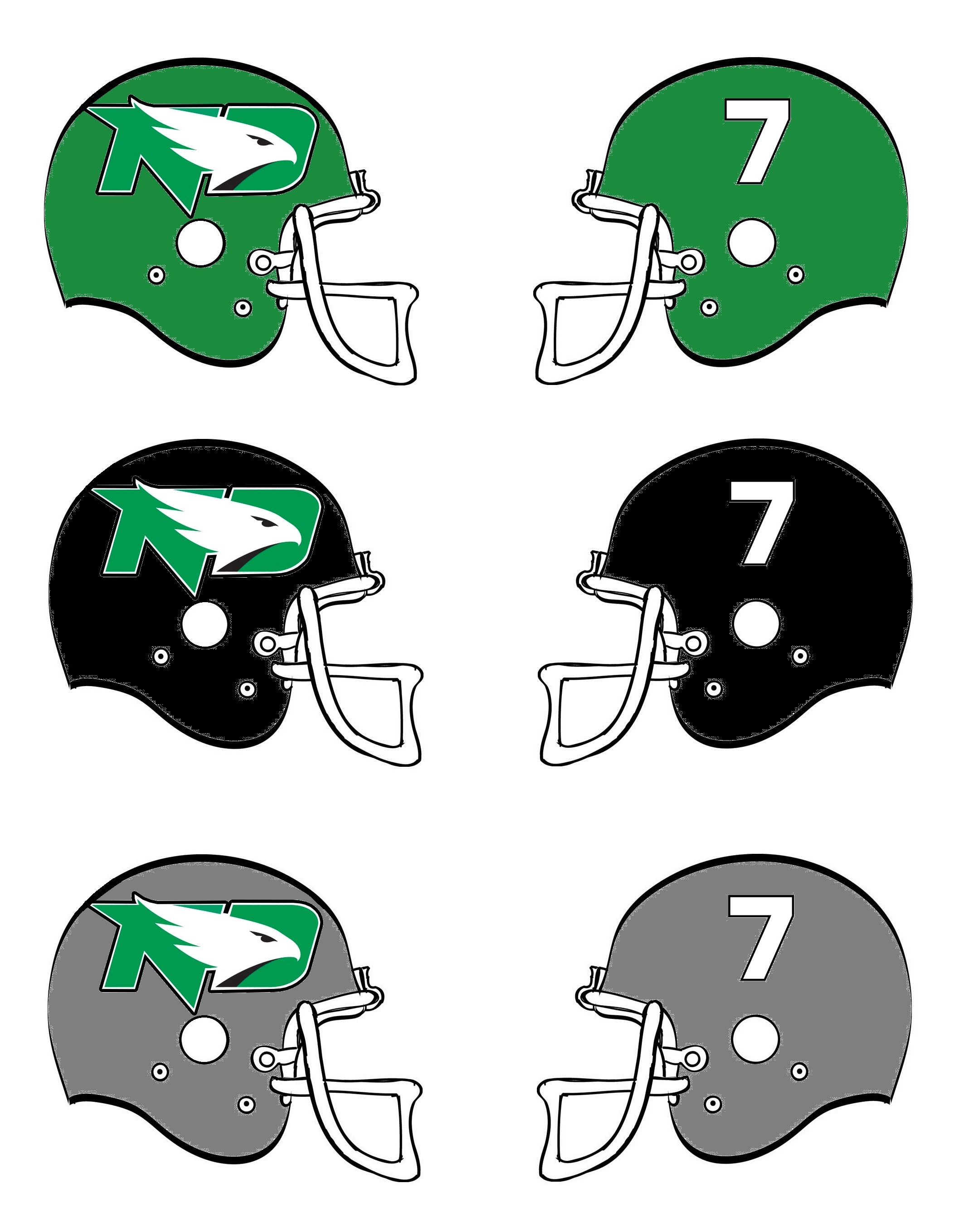
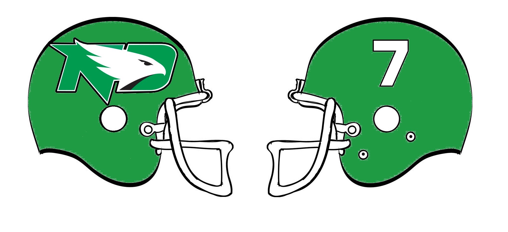
Here's one way to put the logo on both sides of the helmet I guess!!
-
http://www.grandforksherald.com/sports/und-football/4079362-und-football-fighting-hawks-release-new-jersey-option Schweigert said a rumored gray helmet won't be an option in 2016, but "you never know where this goes."
-
Lots of jersey combinations there!! Might as well ad a white helmet to the mix too!!
-
Still wondering how they are going to to the logo on the helmets. I would love to see them go throwback and have each players number opposite the logo.
-
These are great!! Will look even better with the grey helmet with the new logo!
-
University of North Dakota Hockey 2016 - 2017 Season
Siouxperfan7 replied to Frozen4sioux's topic in Men's Hockey
Will be interesting to see where they put Gersich. I think him or Poganski are on the top line with Jost and Boeser. Of course, I am rooting for Pogo to be on the first line so we can have the feared, but classically delicious, PBJ Line!! -
Problem with giving up the seats to season tickets, you can never get them back. I don't think selling off student seats is going to do any good for getting students at the games.
- 66 replies
-
- 4
-

-
- fighting hawks
- football
- (and 3 more)
-
Rainbow references make horrible logos. Just ask Univ of Hawaii.
-
Official SiouxSports.com Logo Reaction Thread and Poll
Siouxperfan7 replied to NoiseInsideMyHead's topic in UND Nickname
You say that with such confidence!! I put the other logos there because those are O's. It's the logo for the U N D. So it is clearly a D. Unless you are just looking for reasons to hate the logo. -
This is the kind of talk I like to hear!!!
-
So our Conference schedule looks like this: @ 7/8 Montana St. 9 Cal Poly @ 11/13 Sacramento St. 7 Southern Utah @ 12/11 Idaho St. 6 Weber @ 10 Northern Colorado 1 Northern Arizona While rankings don't mean too much this time of year, we can now confirm how favorable our schedule appears to be. Only 1 conference game against a team in the top 5, and that is at home versus NAU. We have an even more favorable road schedule. If we take care of business, there is no reason not to think that last game of the year could be for a Conference Championship!!
-
Official SiouxSports.com Logo Reaction Thread and Poll
Siouxperfan7 replied to NoiseInsideMyHead's topic in UND Nickname
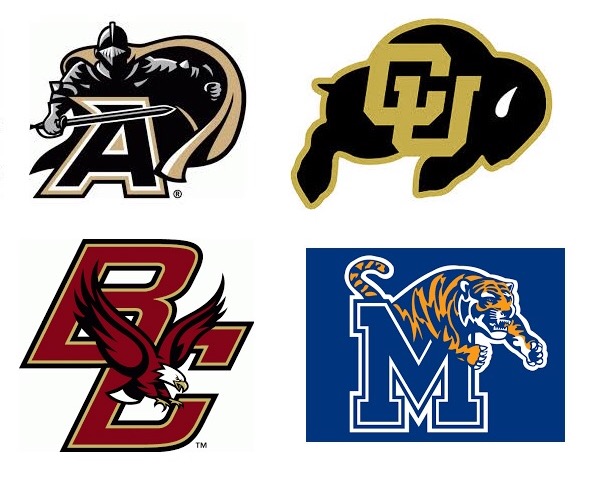
Three of these things belong together Three of these things are kind of the same Can you guess which one of these doesn't belong here? Now it's time to play our game (time to play our game). OK boys and girls. Can you figure out which logo doesn't have an "O" in it?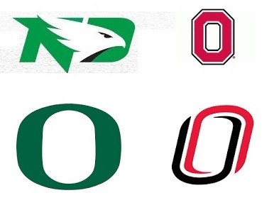
-
Might have to rename them the "Baby Brotherhood" for next year!!
-
When do the preseason rankings come out?