-
Posts
585 -
Joined
-
Last visited
-
Days Won
3
Everything posted by 77iceman
-
Official SiouxSports.com Logo Reaction Thread and Poll
77iceman replied to NoiseInsideMyHead's topic in UND Nickname
The reality is the only people that see the interlocking ND as a North Dakota logo are North Dakota fans. 99.9% of the rest of the world sees it as Notre Dame. -

Official SiouxSports.com Logo Reaction Thread and Poll
77iceman replied to NoiseInsideMyHead's topic in UND Nickname
No matter what the logo . . . i'm on board with a monkey riding a zebra. make it happen!! -

Official SiouxSports.com Logo Reaction Thread and Poll
77iceman replied to NoiseInsideMyHead's topic in UND Nickname
Exactly. When it appears on green or grey, i'm betting it gets the outline. And honestly, when it's no green there may just be a white outline that blends right into the hawk head. I just absolutely hated that t-shirt in the press conference . . . an unacceptable use of the logo if i were writing the brand guide. -

Official SiouxSports.com Logo Reaction Thread and Poll
77iceman replied to NoiseInsideMyHead's topic in UND Nickname
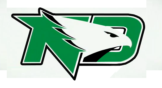
This is the most realistic version of the current logo that I'm betting will appear. Add a simple black outline to the existing artwork. (adding the black to the feathers was something i threw out there to appease my own design sense) -
I still feel that not having the name on the back makes a statement of "playing for a team, not for the individual". Shows some humility and maybe a bit of Lone Ranger attitude . . . "who was that guy that just knocked me out of my socks?" I could see this as being part of Bubba's style. Programs. Just get a program with the roster listing and you'll be ok. My favorite uni is still the all-green look . . . pants, helmet, jersey . . . that was pretty tough looking.
-

Official SiouxSports.com Logo Reaction Thread and Poll
77iceman replied to NoiseInsideMyHead's topic in UND Nickname
Votes and committees = fighting hawks So if it's voted on, people aren't happy. If one person decided it all, people wouldn't be happy. I'm good with the new logo. The sioux head was cool...but i don't sacrifice lambs at its alter. can't wait for seasons to start so focus gets back where it should be. -
I know I'm not the center of the universe . . . so the 1pm start time isn't something that I really want changed. Just for me, it's at the time of day where i either have to get up damn early to drive that morning, or drive later at night to get home that night. We usually get up early and head up that morning (wife works friday nights), and get a hotel on saturday night (which really sucks when there is a hockey game . . . price go up and availability goes down). But it's always a good time!
-
1pm games are tough...i drive 400 miles with wife and daughter. Means leaving damn early.
-
I always felt that not having the player name on the back made a statememt..."we're a team, not individuals". or maybe no names on the jersey helps justify getting a program.
-
I dont read it as a dove...but i do get "bald eagle" out of it. That's why i liked adding some black tips to thise feathers. Just define it as NOT a bald eagle. but i do like the logo as it stands, too. I'd bet $2 that when used on uniforms or helmets they get some sort of outline treatment.
-
I'm totally on board with the logo on one side....Steelers style. Number on the other side or blank is fine with me.
-

Official SiouxSports.com Logo Reaction Thread and Poll
77iceman replied to NoiseInsideMyHead's topic in UND Nickname
"look, the chances of us changing the new logo are one in a million!" "so . . . you're saying there's a chance" -
Let's not get too hasty . . . we don't know that alternate versions have not been created or or not in the works.
-
He was set up in the pistol formation.
- 1 reply
-
- 1
-

-
"(and in no way shape or form is this actually going to get anywhere, i'm just having some fun on the inter web)" Quoting myself I really think that once the current version of the logo gets used, some tweaks will occur. Most logos evolve a bit . . . over the years. Again, I like the general dynamic and imagery of the SME original logo . . . I (my opinion) just felt that it lacked the "sport" look. I was just having some fun and developing it further as the comments on here were suggesting. It's basically the same logo here, I just added some more frosting. Even just a black outline to the logo that they have now makes a huge difference in the boldness of it.
-

Official SiouxSports.com Logo Reaction Thread and Poll
77iceman replied to NoiseInsideMyHead's topic in UND Nickname
i think everything being debated here is about respect. I think any student athlete, be it hockey, golf, tennis, swimming, chess . . . any of them can and should have an opinion. It's in how and where you state your opinion that usually creates the conflicts. "i'm not a fan of the new name or logo, but i'm a fan of the University that it now represents." That comes across a little more respectful than a flurry of f' bombs and insults, but it gets the same point across. But, not everyone is the same. I tend to have a harsh opinion in a soft voice. Others have harsh opinions in loud voices. -
well, we'll disagree on the points of the N . . . but mostly we can agree that some outlining and black details help it stand out. But, whatever. That was fun to jack around with for a bit. Go HAWKS (no matter what you're logo looks like)
-
Dear SME : Leave it. Ah, the life of a designer . . . not everyone will ever have the same opinion
-
The interlocking ND disappearing is probably UND's way of making the new logo valid. It's harsh way of doing so, but I see where they are coming from. I see it as a way to get ALL teams to use the new logo with no other option. Honestly, I think Notre Dame every time I see the interlocking ND. I liked it, but it always felt like a "me too" image. Bubba is the man. Side note (I wish UND could have just used the Atlanta Falcons identity with black and green) . . . I've always like that logo. Will would approve
-
-
None of this matters, really . . . but I still don't think the logo is as far off as everyone thinks. I just added a little shape and form with some black and made the D more D'like. And I'll add that the only reason I'm doing this is because I actually do like the new logo, if the logo were for a bank or real estate agency. (and in no way shape or form is this actually going to get anywhere, i'm just having some fun on the inter web)
-
The intent of this whole thing was to erase the Sioux name and imagery from the school's current identity. Too keep the Sioux name would have taken the right people to speak up and the right time . . . and that just didn't happen. And here's where I'll get the most kick back. I'm glad the new logo has no ties to the Sioux imagery. In fact, if this is all about the Sioux name being offensive, let's be consistent and take it off of all of the rivers, lakes, streets, cities, etc . . . if it's so truly offensive to people, why is it used ANYWHERE anymore? Same with FIghting Irish, Seminoles, Vikings, Bucaneers, Raiders . . . anything that is derived from a certain group of people should be deemed offensive then, too, right? If people are going to be this stupid about being PC, then bury it! I'm not going to be one of the guys still yelling "Go Sioux". In fact, I'm to the point that I just don't miss it at alll. I certainly don't blame the University. I doubt this helped their image, their heritage, or their finances. And getting rid of the interlocked ND was a way of forcing the new logo onto ALL of the teams. There's no other option anymore. Like I said before, "well played UND, well played." GO HAWKS!!
-
You know . . . i wouldn't mind seeing them go all "Pittsburgh Steelers" with this by just having the new Hawk logo on just one side (facing forward). I always thought that, even though that logo itself isn't anything too exciting, just having it on one side was always kinda cool.
-

Official SiouxSports.com Logo Reaction Thread and Poll
77iceman replied to NoiseInsideMyHead's topic in UND Nickname
No mention of the strong arm of the NCAA in there anywhere. Shouldn't that still be the biggest part of story?


