SIOUXFAN97
-
Posts
16,345 -
Joined
-
Last visited
-
Days Won
76
Everything posted by SIOUXFAN97
-
and part of what fenton is doing is trying to lock up St Thomas from jumping ship in five years...He wants them long long term and a hockey conference with larger d1 schools in larger markets will help keep the Tommies around hopefully for a long time a hockey conference of all d1 schools would a nice selling point for keeping them around UND, St Thomas, Omaha, Denver, ASU, Miami, Western Michigan, and then BGreen or AF would be nice and olym of UND, NDSU, USD, SDSU, Omaha, Denver, Oral Rob, KC, Western Ill, St Thomas, would be nice
-
and you didn't answer the q...what does CC bring to the table thru the eyes of Fenton? he is trying to make the Summit a stable conference instead of a revolving door conference and one of those tasks is getting a core group of regionally based schools to stay together instead of jumping to greener pastures (and you can't fault those schools for doing so)... and you used the word booted....no one is betting booted...just not "invited". fenton will "invite" the 3 summit schools to join the Summit and St Thomas for a core of 4 and then look to "invite" 4-6 affiliate schools to join the summit league...UMD, SCSU, Miami, W Michigan, Bowling Green, AF, ASU, Minny St, CC ,and Augie are all in the running for those spots....
-
it's a done deal....it's happening soon...
-
but you have to look at thru the eyes of a commish (fenton)...what does a d3 school like CC bring to the conference in terms of $, competition, and or eyeballs? CC really doesn't do anything for summit hockey as an affiliate.
-
WWGCD?
-
agree if you say add AF and you kept cc but if we added AF and dropped CC that's a win for Summit hockey
-
cc hasn't been relevant for ...........decades?
-
i know travel doesn't mean much to AF but....just saying
-
probably not...but it's a possibility...plus they can still play army ooc
-
explain "watered down"
-
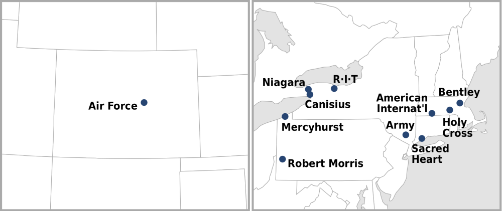
who would you rather have as a conference member (remember you can still play OTHER schools OOC) ......as a fan and as a commish Arizona State or UM-Duluth Air Force or CC Bowling Green or SCSU pretty easy for me....
-
all d1 summit hockey? UND Denver Omaha St Thomas Miami Western Michigan Bowling Green Arizona State Air Force the other UND?
-
i do wonder about how safe CC is and maybe even UMD & SCSU are...maybe fenton wants "BIG TIME" schools only...
-
if the new summit hockey included commish doesn't realize that d1 hockey a. makes money and b. can actually win a true d1 title they be stupid
-
and the crowd too
-
what's the difference?
-
on the coulee south of the wellness center
-
https://www.grandforksherald.com/sports/und-hockey/daily-skate-nchc-discusses-the-possibility-of-adding-arizona-state THERE'S FENTON!
-
fake news
-
wonder if comrade popovich deleted phil from his cherry pink iphone 27?
-
https://nypost.com/2023/04/22/phil-jackson-says-he-doesnt-watch-nba-because-its-too-political/ wowser
-
BRING BACK BRUNS!!!!!!!!!!!!! kidding.
-
are we talking academics? i thought with the portal you can go whereveer you and play right away?