
Cratter
-
Posts
16,133 -
Joined
-
Last visited
-
Days Won
49
Everything posted by Cratter
-
I forgot the math and I'm too lazy to do it again, but given the size of the Fargodome relative to the size of Fargo when the dome was built....the Fargodome today would have to be built for 35,000ish. ....there's no doubt a new stadium is needed in Fargo, if not today, tomorrow....and they could be making a big mistake the longer they wait. Keep growing and winning games...all a program can do. If an FBS invite comes down the road; great, evaluate.
-
That was fun.
-
What's that have to do with a new larger stadium?
-
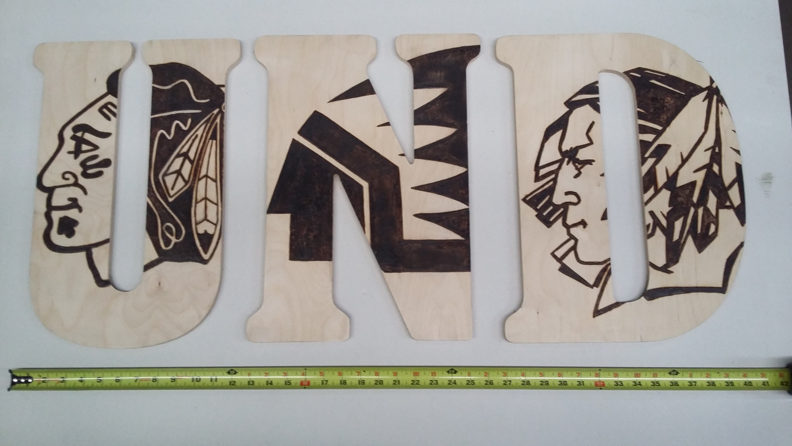
The Fighting Hawks logo is jinxed!
-
It is pretty sad with all the success there doesn't seem to be any real discussion of having a NDSU football stadium for the future.
-
Looks like I'll have a bunch more arm and leg room the next home game.
-
Well the USD coach did take bubbas players and won a national championship the next year.
-
From what I've seen so far this season, I think it's going to be a long season.
-
Bartles killing it on kickoff returns.
-
I see USD must care more about the name on the back than on the front.
-
Sadly been a reoccurring theme for a long long time.
-
Well done Bison. Time to get a bigger football stadium.
-
Shouldn't be a surprise to anyone. Bison should have been favored.
-
All relative, he also had the best oline and receivers he has ever seen.
-
Think Bubba will have a little extra motivation to beat his former boss?
-
The Bison are going to be making history today on ESPN2.
-
You almost make me wanna stay home and watch the game on tv tomorrow.
-
Anyone going to purchase the "Raise It" DVD?
Cratter replied to Emerald joker's topic in Men's Hockey
So blu ray? It would be nice to be able to see the entire celebration as I can watch the games anytime on YouTube. -
Anyone going to purchase the "Raise It" DVD?
Cratter replied to Emerald joker's topic in Men's Hockey
Is it available for download? Don't particularly care to own physical copies of videos these days. -
It's starting to become a pattern.
-
Had same thoughts. Midco games on ESPN3....I guess it's possible.
-
Brescani is the one trying to pull the strings behind the scene.
-
Chains, are just local places that were some of the best, that there was demand for them in other towns, and more towns....chains have a consistent quality that usually isn't seen with some other restaurants. ..Dakota Harvest Bakery could have been a uber success and opened (franchised) all across the country...and some person in St. Kathy, Ohio would complain "oh great another chain restaurant."
-
Chik fil A coming to the Grand Cities.
-
After just barely beating NDSU, Texas Tech dominated UND winning 3-0.

