Siouxperfan7
-
Posts
6,864 -
Joined
-
Last visited
-
Days Won
97
Everything posted by Siouxperfan7
-
I wasn't there. But this was sent to me by someone who was.
-
I do find it pretty funny how last year at this time, people were calling for Kelley's head and demanded he be fired for things that pale in comparison to what Bresciani has done, and people are signing petitions in support of him!!
-
Hey smart guy, merchandise comes out tomorrow. So your cute little comments make you look pretty stupid.
-
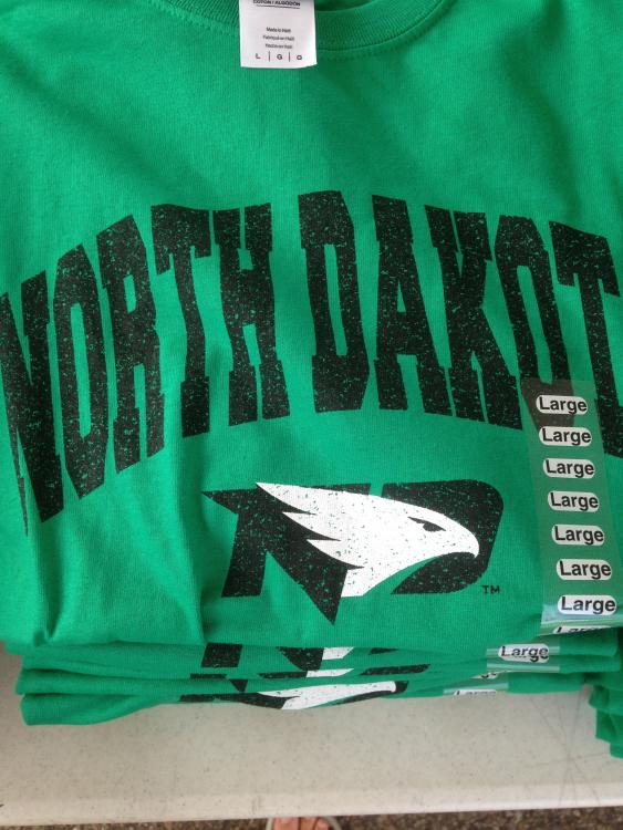
I don't think anyone was making predictions of how much "merchandise without the new logo" would sell. I have bought 1 shirt with "Fighting HAwks" on it and that was a National Championship shirt. When the merchandise comes out with the logo, it will sell. Sorry if that ruins your doom and gloom predictions of the new logo not being popular. If you don't want to buy it, that's fine. But people will. Remember all the people (maybe you) that said just plain "North Dakota" merchandise with the interlocking ND wouldn't sell? They were proven wrong. And theyw nae sayers will be proven wrong again here. As for me, I will but the new merchandise. #getfhawkedup
-
#BrescianiForever
-
As much as we all want to see the Bison football team lay and egg and have a losing season and not make the playoffs, If I was a betting man, I wouldn't take that bet. That would be like a St Cloud St. fan hping UND hockey missed the playoffs for 2 or so years in a row. The Bison have one of the best programs in the FCS. As much as I hate to say it, that isn't going to change anytime soon.
-
Hey, remember in 2002 when NDSU announced they were moving up to D1 and were disappointed that UND didn't do the same? Yeah, that was 14 years ago. Presidents, AD's, coaches, etc for then are long gone. I think its maybe time to get over it. The "deep wound" that NDSU has due to UND choosing not to move up the same time sure does take a long time to heal. You ask why schedule this game? Why do UND fans want this game played more often? If you attended NDSU games in 2003 and every year prior, you would understand why.
-
The President of NDSU lied. And then it was exposed to everyone that he lied and blamed his subordinates for not giving hime the information when the result of his lie proved to be very unpopular. Is this a big deal? Should the Forum and Rob Port be writing articles about it? Well, when you are a President of a state funded University and you are exposed for lying and trying to cover it up, I guess it is news. Should Bresciani be fired over it? Well, I guess that's for the SBOHE to decide. It is definitely not the thing you want o do when your contract is being reviewed by the SBOHE. For all the Bison fans on here and elsewhere, if you think its not a big deal, then stop commenting on it. The fact that people are still talking about it validates that it is a least worthy of talking about.
-
It would be very unfortunate if they did not. However, I don't think they have much choice in the matter. I see them having it. Do you think Faison wants Berry to answer the question "your womens team has the new logo on their helmet, even your football team has it on their helmet. Why does your team refuse to embrace the new logo?"
-
So can we assume the men's team will have the same sticker on their helmets?!!
-
I miss the good old days of DaveK's self imposed ban on this site. Probably more than I miss the Sioux name and logo!!
-
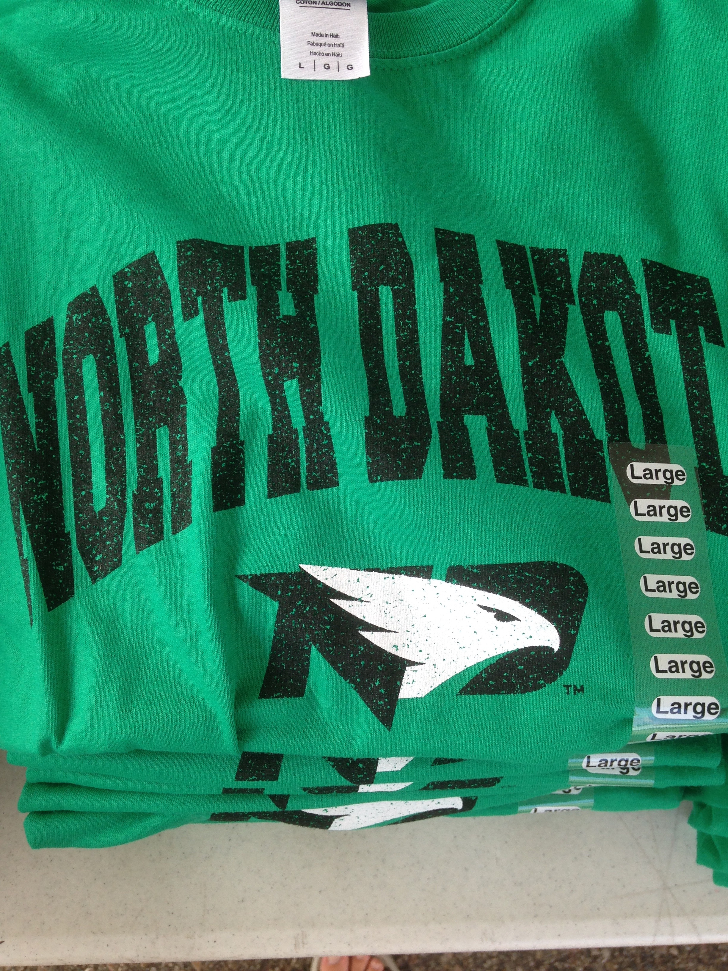
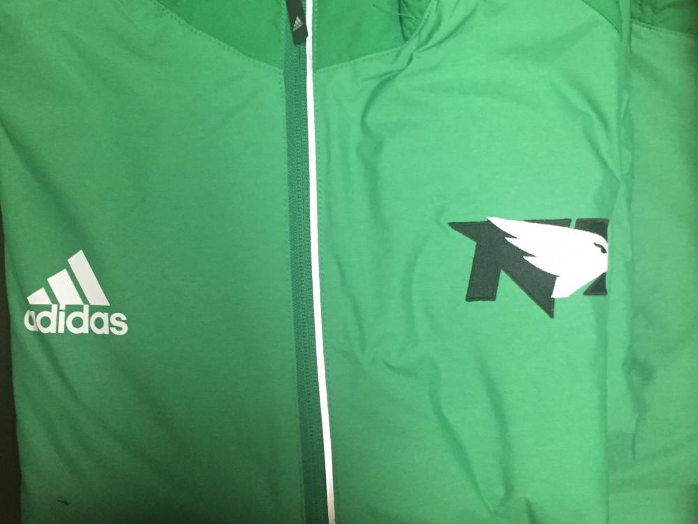
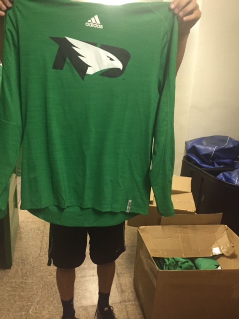
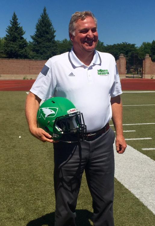
We got a sneak peak at some clothing with the new logo on it at media day. I think it looks really good. I really like the alternate logo with the black letters on the green background. 9 more days till the rest of us can get our hands on some new merch!
-
I would say a healthy Santiago is just as important. But maybe that goes without saying!
-
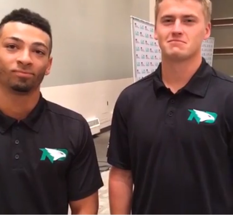
Media day!! Like the look of the logo on the black shirts!!
-

-
Or Rob Port, McFeeley, or the Forum.
-
Football jerseys used to be the same block lettering for decades. I like how teams are changing it up. Look at the Minnesota Vikings. They have their own font for their wordmark and for their numbers as well. Breaks up the monotony of the same old thing. Mixing it up with something new is refreshing.
-
You know who really likes the new helmets? THIS GUY!!!
-
Airbrushed? You serious? NFL teams don't even airbrush their logos on their helmets!
-
Official SiouxSports.com Logo Reaction Thread and Poll
Siouxperfan7 replied to NoiseInsideMyHead's topic in UND Nickname
- New logo - New helmet - New gray jerseys for the football team. I'd day those are exciting news stories. What were you expecting??!! -
They made it up to you. Ask and you shall receive!!

-
Maybe. But why tweet out several pictures of a gray helmet last spring? Just saying I have a hunch. We will see September 17th!!
-
Bison fans can claim that this is a non issue and that now that the policy is rescinded, the story is over. But really it's not. The story has moved from this awful policy to the mismanagement of NDSU brass at the top. Lots of unanswered questions that will most likely be answered due to open record laws.
-
Pretty hard to disagree with Rob here!! https://www.sayanythingblog.com/entry/ndsu-rescinds-ridiculous-new-media-rules-bresciani-claims-wasnt-aware/
-
I guess if Jorgenson get let go because of this, they can always get hired on Kliemans staff as defensive backs coaches due to their incredible backpedaling skills!!