
The Sicatoka
-
Posts
38,193 -
Joined
-
Days Won
596
Everything posted by The Sicatoka
-
I've said from the start that logo looks best small, like a shoulder patch or on a helmet, or like the FB teams' polos. And I don't mind Lexie Shaw's new blocker. The split logo on the pads? Meh.
-
Here it is, about SBU, about BGSU, point blank. Screw it. Screw them. I don't care how good SBU's defense supposedly is/am/was. I don't care. I don't care how whatever BGSU's offense is. It doesn't matter. I don't care. I say quit psyching ourselves out with "but their whatever is soooo good". Quit looking and worrying about the other guy. Worry about us, just our team, getting better, day by day. Control what is ours to control: our style, our effort, our assignments, our enthusiasm, our mistakes, our game. Play UND Football. Nothing else matters.
-
President Kennedy Message on Athletics
The Sicatoka replied to fightingsioux4life's topic in Other Sports
He missed where Kennedy has publicly stated, twice, that he has review committees in place (Athletics, and campus) to gather and evaluate information but that the final decisions reside with him. -
We're not looking. It's called a full review. Asking internally "Are we in the right conference?" is not the same as actively looking for a new one.
-
I mean no disrespect and wish no harm to Carson Wentz, but looking at what Philly has around him, what'll happen first: (A) he misses a start due to injury, or (B) he suffers his sixth loss as an NFL starter (one more than the five losses in his five years at NDSU).
-
-
University of North Dakota Hockey 2016 - 2017 Season
The Sicatoka replied to Frozen4sioux's topic in Men's Hockey
It's not all-time conference titles .... that's 17 ... so ... after this season? -
Next you'll claim it's Mafia in a monkey suit.
-
The 2000 Baltimore Ravens on line one for you ...
-
Expert video analysis by a crack(-using) staff made up of Minnesota Gopher fans has confirmed Mafia's video is a FAKE. Their proof is in the claim that it was shot in North Dakota and appears to show leaves from trees. Every Goophie fan will tell you that's impossible as North Dakota has no trees.
-
Daunte! Daunte! Daunte! Daunte! Daunte! Daunte! Daunte! Daunte! Daunte!
-
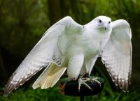
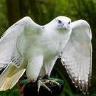
How some reacted to the new nickname and logo: http://www.cbsnews.com/news/caught-on-camera-hawk-checks-out-tv-stations-towercam/
-
So Bresciani has a goal to make NDSU AAU ....
The Sicatoka replied to SiouxVolley's topic in Community
Come on '73, don't be obtuse. More than half the ND SBoHE right now has ties to NDSU, including a member that used to be the head NDSU FB coach. -
Thinking a little more about a Santiago in the slot once in a while scenario: First, it's a total mismatch on a LB as far as speed if John runs a route. That moves a safety over the top for support. Brady and Oscar would love that. Next, if you motion him across (jet sweep) that forces the CB on the side he's running toward to make a decision: either stay on top of the receiver on that side and get blocked and possibly lose contain or shift to outside leverage (in the hope of keeping Santiago inside, contained, where there's tackling help) but that gives the WR the quick inside slant, and that's a throw Studsrud can make.
-
Straight up oatmeal chocolate chip!
-
Losing Clive hurts. But they took two true freshman receivers on the road. Time for the boys to become men. But here's the wacky thought -- does losing Clive (a) pull the redshirt off another freshman, like the good receiving TE, and (b) does this put Santiago into the slot more often with Brady or Oscar in the backfield. Why not put the best weapons out on offense. Or better: Who wants to see Santiago coming across on a jet sweep. Surely not opposing defenses.
-
First, I didn't like how close SB was getting to the punter in the first half. That was not adjusted at halftime. Next, it's the first game. On the road. With a new offensive line. Will they see a defensive front like that again this season? Coach Knauf will make adjustments as warranted. Additionally, here's hoping SB wins the CAA this season. Finally, just win the next game.
-
How about getting Studsrud into the game with a called QB draw.
-
Time to just go eight on the line with a FB and Olivera.
-
They're not apes; they're burros.
-
You NEVER fair catch inside the 10 ... but SBU did.
-
They are massively keying on 22.
-
"Caught by gorgeous Clive Georges ... " - Jack Michaels.
-
Needed the flop of field position badly.
-
Studsrud needs to calm down and hit those two throws.
