Prison_Mike
-
Posts
598 -
Joined
-
Last visited
-
Days Won
9
Everything posted by Prison_Mike
-
No s*** Sherlock...
-
Didn’t he come with Ryan Duncan on his recruiting trip to UND?
-
This thread is about FBS, not FCS nerf ball.
-
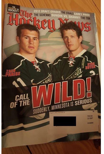
Hockey News from 7 years ago today.
-
https://en.m.wikipedia.org/wiki/Winter_Sports_Building
-
You’re correct, when Toews and Oshie played they worn Nike jerseys that had the old interlocking ND.
-
When they get a hawk logo that actually looks good, I would be all for it. The current logo seems like a secondary logo, like this NDSU one. It is fine on the shoulder but would look like s*** on the front of a jersey. The interlocking ND would also look like s*** on the front of a jersey.
-

-
-
Serious question. How many of those Olympians were on team Canada or team USA besides the twins? Those are the only two counties that produce talent.
-
Somebody pitch a tent over this circus.
-
Another thread hijacked by the pro-Sioux Pro-Fighting Hawks supports. Thanks everyone!
-
The WNBA loses money every year for the NBA. No way the NHL gets involved in this s*** show.
-
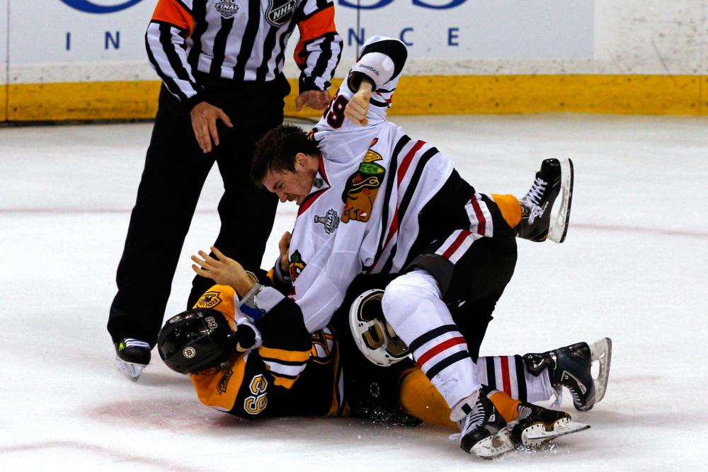
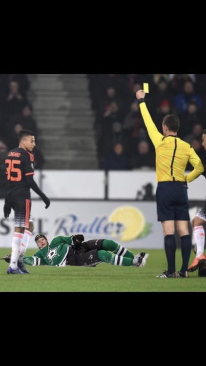
I could look at this picture all day
-
-
Wow...three consecutive dives by Lindell. What a jackass...
-
I just bought an NHL authentic Adidas jersey online a few weeks ago and was not impressed.
-
Just one cup in 2004.
-
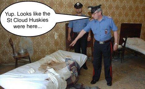
The Tampa Bay Lightning appear to be the St Cloud Huskies of the NHL...
-
-
-
Apparently the drive from St Cloud to St Paul is too much for the Husky fans...
-
Worn against Northeasten on October 14, 2005.