
ArchyAlum11
-
Posts
534 -
Joined
-
Last visited
-
Days Won
2
Everything posted by ArchyAlum11
-

Official SiouxSports.com Logo Reaction Thread and Poll
ArchyAlum11 replied to NoiseInsideMyHead's topic in UND Nickname
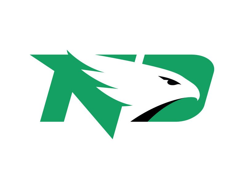
Well I wouldn't say lost, adding a new logo is a much much easier process, one that they will probably start on a lot quicker if the new logo doesn't perform well. Despite Bubba's call to embrace the new logo, I doubt people are going to be running out in droves to buy gear with the UND post offi... er I mean the fighting hawks logo. People will likely rush to buy up non nickname apparel. I almost want to believe the put out a logo they knew most of us would hate just so we would be focusing on getting a better fighting hawks logo, and not complaining about how much the new nickname sucks. -
Official SiouxSports.com Logo Reaction Thread and Poll
ArchyAlum11 replied to NoiseInsideMyHead's topic in UND Nickname
And the new logo doesn't really work for hockey uniform, even the font looks to futuristic, which I personally am not a fan of. As I said before by and large hockey, especially college hockey tends to go for a classic look, even as secondary logo this is not really ideal for hockey.Personally I don't think it will look that great for football, but we'll see. If they are smart they will be very cautious about how they use it for hockey, I would venture a guess that you would see jersy sales drop pretty quick if stuck this logo on the hockey jerseys. i have two fighting Sioux jerseys and i will be getting a UND jersey soon just encase thought. I think you may see a small rush on non hawks apparel in the July as people stock up before everything has the new logo. However the silver lining is changing a logo is a lot easier than changing the nickname. HYPOTHETICALLY, it would take years to get the university to switch to a new nickname. However it may only take 1-2 years to introduce a different logo, especially if the first one performs poorly.. -
Official SiouxSports.com Logo Reaction Thread and Poll
ArchyAlum11 replied to NoiseInsideMyHead's topic in UND Nickname
My guess is that in the next two or three years you will see other logos or variations on this logo, the only place where I think this logo fits is with the aviation program and the flying team. -
DAMN YOU DYSLEXIA!!
-
Better than the post office logo.

-
Official SiouxSports.com Logo Reaction Thread and Poll
ArchyAlum11 replied to NoiseInsideMyHead's topic in UND Nickname
Well the Football program spent years not really embracing the logo, now they are embracing the new logo and name. In contrast the Hockey program really embraced the fighting Sioux logo and Identity, and now they are not really embracing the new nickname or logo. The teams all have their own different sub cultures and styles, and the logo and font style doesn't really look great on hockey, especially considering the for hockey the tendency is to go for an older or more retro look rather than futuristic -
Not sure how that will look, but I guess we'll see. The only place so far where I can see this logo really looking good is on the Airplanes.
-
Official SiouxSports.com Logo Reaction Thread and Poll
ArchyAlum11 replied to NoiseInsideMyHead's topic in UND Nickname
This would have worked fine if it were just for the aviation program or the fly team, it has a similar desing style to what you see for many airlines. But for me it dosen't work as a sports logo from my point of view. -
Official SiouxSports.com Logo Reaction Thread and Poll
ArchyAlum11 replied to NoiseInsideMyHead's topic in UND Nickname
This might be an understatement but here goes... -
Official SiouxSports.com Logo Reaction Thread and Poll
ArchyAlum11 replied to NoiseInsideMyHead's topic in UND Nickname
Post office why to you take forever.... Burlington Northern your going to slow.... faster! -
Official SiouxSports.com Logo Reaction Thread and Poll
ArchyAlum11 replied to NoiseInsideMyHead's topic in UND Nickname
Plagiarism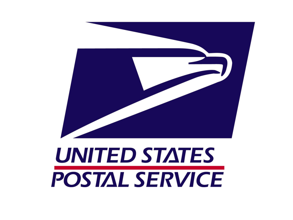
-
Official SiouxSports.com Logo Reaction Thread and Poll
ArchyAlum11 replied to NoiseInsideMyHead's topic in UND Nickname
I prefer it to what we got... though Someone should start either a North Dakota Airways or North Dakota Parcel Service because this logo would be great for either of those things. -
Official SiouxSports.com Logo Reaction Thread and Poll
ArchyAlum11 replied to NoiseInsideMyHead's topic in UND Nickname
Well judging by the fact that the internet didn't really exist in 1969, I'm gonna guess no. -
Official SiouxSports.com Logo Reaction Thread and Poll
ArchyAlum11 replied to NoiseInsideMyHead's topic in UND Nickname
Yes I suppose a steaming pile of crap is better than a fresh puddle of vomit... -
Official SiouxSports.com Logo Reaction Thread and Poll
ArchyAlum11 replied to NoiseInsideMyHead's topic in UND Nickname
And now comes the 2nd rush on UND gear, people buying North Dakota gear before they shove the new logo down our throats. -
Official SiouxSports.com Logo Reaction Thread and Poll
ArchyAlum11 replied to NoiseInsideMyHead's topic in UND Nickname
voted for fighting hawks out of Roughriders, North Stars, Nodaks, and Sun Dogs. Lets not pretend like they had a ton of choices. -
Official SiouxSports.com Logo Reaction Thread and Poll
ArchyAlum11 replied to NoiseInsideMyHead's topic in UND Nickname
$50,000 bucks. I think that UND graphic design students could have done the same thing in about a week. -
Official SiouxSports.com Logo Reaction Thread and Poll
ArchyAlum11 replied to NoiseInsideMyHead's topic in UND Nickname
The one thing this did do was make the Bennett Brien hawks logo grow on me... at least he put some effort into it. -
Official SiouxSports.com Logo Reaction Thread and Poll
ArchyAlum11 replied to NoiseInsideMyHead's topic in UND Nickname
Wait I thought the school song was "In Heaven There is No Beer" -
Official SiouxSports.com Logo Reaction Thread and Poll
ArchyAlum11 replied to NoiseInsideMyHead's topic in UND Nickname
SME or Bennett Brien vs -
Official SiouxSports.com Logo Reaction Thread and Poll
ArchyAlum11 replied to NoiseInsideMyHead's topic in UND Nickname
I won't tell him he's wrong, I will say that I don't like the new logo. -
Official SiouxSports.com Logo Reaction Thread and Poll
ArchyAlum11 replied to NoiseInsideMyHead's topic in UND Nickname
I really don't like the font style looks like something out of a science fiction movie... not in a good way. -
Official SiouxSports.com Logo Reaction Thread and Poll
ArchyAlum11 replied to NoiseInsideMyHead's topic in UND Nickname
It not making me rage but it just looks like a seed brand logo for some reasons. -
Official SiouxSports.com Logo Reaction Thread and Poll
ArchyAlum11 replied to NoiseInsideMyHead's topic in UND Nickname
No...


