
dagies
-
Posts
8,901 -
Joined
-
Last visited
-
Days Won
5
Everything posted by dagies
-
University of North Dakota Hockey 2017-18 Season
dagies replied to Frozen4sioux's topic in Men's Hockey
same page -
University of North Dakota Hockey 2017-18 Season
dagies replied to Frozen4sioux's topic in Men's Hockey
Based on the evidence provided I think it may have been offsides. But the available images were far from conclusive and should never have resulted in a reversed call. -
University of North Dakota Hockey 2017-18 Season
dagies replied to Frozen4sioux's topic in Men's Hockey
Bulldogs and Gophers. They didn't have to look long and hard, did they.... -
those seem weird to me (the TB stripes)
-
has anyone heard an explanation for the black under arms? It doesn't strike me as a good visual accent, so almost had to be some other reason
-
guys, let's toe the line and stay on topic and out of politics
-
Not everybody can have my good taste.
-
At first? It's still ugly
-
No, I didn't, was just curious what it might look like. Thanks for doing it. Proves I do prefer the logo without the ND behind it.
-
I get that the hawk head on the ND is the logo, but I still can't get over the corporate look of that logo and it doesn't work for me on that mock-up. Curious, is it possible, or how difficult would it be, just just put the hawk head on the jersey and remove the ND part, just for kicks?
-
Never was a fan of the diagonal stripes. NEVER
-
University of North Dakota Hockey 2017-18 Season
dagies replied to Frozen4sioux's topic in Men's Hockey
Not to mention feeling like the team owes them a win -
AMEN to that.
-
agreed. oof
-
agree
-
Actually, they did. It's just that he made an "impulsive decision" choosing UND over MN at this time.
-
It's not the logo I want, but that jersey is actually not bad. I like the style of the jersey itself.
-
back to a conversation from a bit earlier. First, I dislike the new name as much as anyone. And I'm not a fan of the new logo. that said, a buddy was at the recent UND night at the Twins game and his wife did not care for the baseball hat so he gave it to me. I have to say, the logo, as a small icon, actually looks pretty good on that hat. I still don't like the big logo on the football helmets, and am guessing this is one of those things that might look better smaller than larger. Just the way I thought the Brien logo was fantastic as a large image but pretty poor as a small image on a baseball hat, etc. So, at least that's nice.
-
University of North Dakota Hockey 2017-18 Season
dagies replied to Frozen4sioux's topic in Men's Hockey
thank you -
University of North Dakota Hockey 2017-18 Season
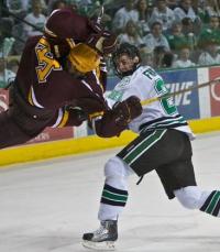
dagies replied to Frozen4sioux's topic in Men's Hockey
what a great photo -
nice!
-
No gopher fan has had training with buck pitchers at the Spud.
-
Including the annoying jerks that showed up drunk near us, year after year.
-
First off, I'm totally with you on your point. That said, honestly, thank God we're not the Huskies. That actually would have been worse.
-
University of North Dakota Hockey 2017-18 Season
dagies replied to Frozen4sioux's topic in Men's Hockey
Either that or goes somewhere else

