
dagies
-
Posts
8,899 -
Joined
-
Last visited
-
Days Won
5
Posts posted by dagies
-
-
On 2/4/2016 at 9:34 PM, fightingsioux4life said:
Hmmm, let's see: A program that has done absolutely nothing in Division I hockey (UConn) and a program that is just beginning its transition from ACHA to NCAA Division I (Arizona State). Yep, that'll really boost the PWR of the league.

They desperately want someone else to be the bottom feeders
-
 1
1
-
-
8 hours ago, 77iceman said:
putting together some suggestions from people here . . . but really just doing what i want to do because nobody
is paying me for this
")
Adding some colors from the Sioux era makes this a little more interesting, and might even get a slight smile from the
die-hard "Sioux or nothing" crowd.
but whatever. i'm just havin fun.

I like it
-
5 hours ago, Cratter said:
I've said before, I wouldn't be surprised if it was some "abstract" logo:

I don't mind abstract, if it's good
-
based on what we know of each finalist, this was my preferred option too, but I also appreciated Summit coming by and letting us at least talk smart. I sure hope SME can pull it off.
I see the story references a possible opportunity for the public to give their opinions. Will be curious how that takes shape.
-
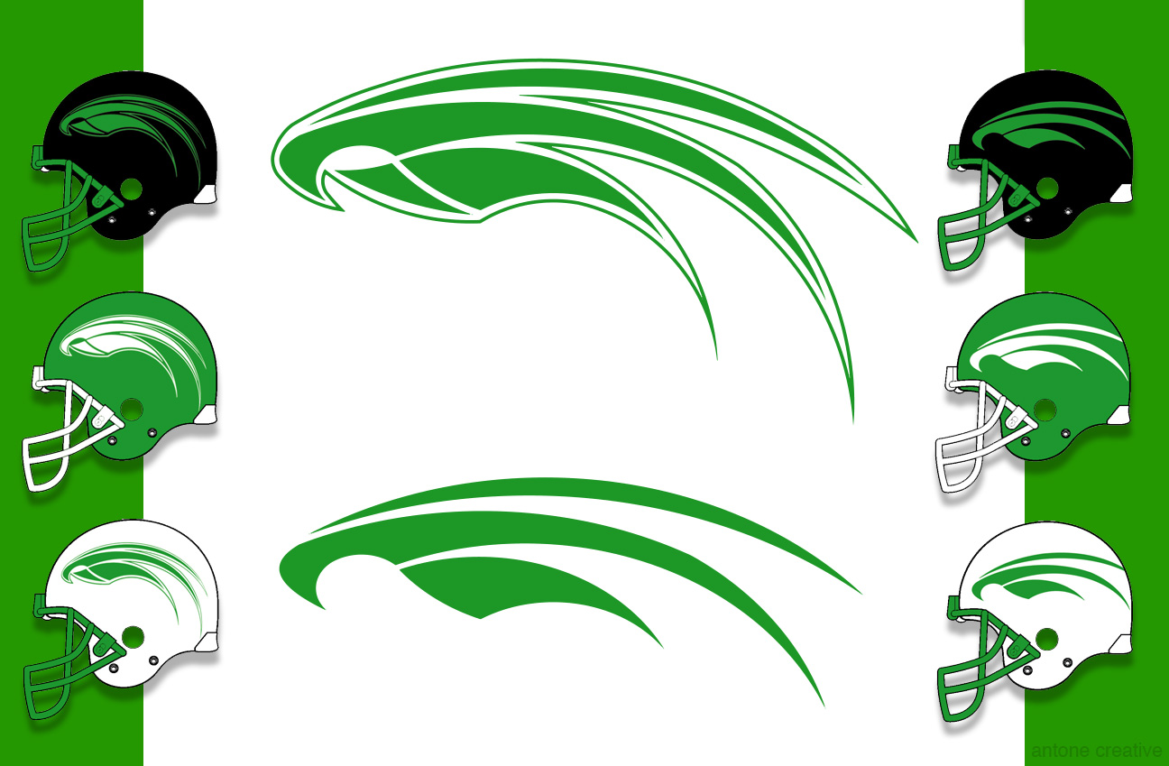
18 minutes ago, dakota said:
Or 77iceman's wings have my vote.
Totally agree with this. I really like 77iceman's
-
1
-
 1
1
-
-
2 hours ago, SIOUXFAN97 said:

ooooh, ugly. I get the idea though> Way too busy
-
2 hours ago, InHeavenThereIsNoBeer said:
Not saying this is perfect, but it's more towards a geometric type logo that I'd prefer...

I'd agree with you
-
By no means do I have a clean mouth at a hockey game but I do try to know who's around me and if there are kids in the vicinity I try to at least clean up.
I think my main point is that a crowd doesn't require profanity to be intimidating. I'm not going to crumb too much on the student section because a big part of the game day experience is due to their energy. So I don't want to stifle that. I'd just hope people realize that profanity itself isn't intimidating, so there's little point to it.
-
1
-
-
4 hours ago, 808287 said:
If you were sitting in the same section I was you heard me yelling "Who's she, she sucks $#!t!" when every opposing player was announced before the puck drop. "Phu-king sieve"(repeat) when a goal was scored, and a few other less ritualistic taunts at refs (Ricci for sure) and other players (Pitlick was an obvious target). The Farce was half way over the glass into the penalty box whenever an opponent sat within, and half way over the glass when play was along the boards in front of them. And I thought it was a great atmosphere. That said, I'm sure that parents and grandparents on the other side of the arena could have gone without, BUT...in a conversation I had (years later) with a former Gopher trainer, I was told that the atmosphere in that arena was the most intimidating and unfriendly place to play in the WCHA. That made me feel like a good fan for helping my team out. Or at least, I justified it that way.
Oh, we must not have been in the same section but I'm sure you are correct and it could have happened. I'll wager it could have been just as intimidating without the "sxxt" and some of the rest. But that's just me.
-
1
-
-
1 hour ago, iramurphy said:
No, not all student sections are as crude as ours. There are fans everywhere who are worse as individuals and small groups, but as an entire student section ours isn't very classy. I also don't expect it to be like church. I expect it to be a sporting event where people know the difference between being loud and obnoxious and crossing the line of what is acceptable. If our students can't do better than that, they aren't very clever. I guess I expect more from UND students. One blogger seemed miffed that another school would yell something at us, and I just pointed out that we aren't any better. If our students yell what they yell then we shouldn't complain if we are called "whiney bi.ches". If so, it would then seem the WMU students are spot on. I was a student fan once and we didn't have to be that crude to harass other teams and we were certainly able to get the attention of the other players, coaches and the refs. I also don't think it is going to change, and I won't lose sleep over it, I just think being clever rather than crude is more effective in harassing other teams and a better image for our students and fans.
Right on. Back in the 80's we chanted "who's he, he sucks" but never took it further and I still don't see the point. In fact, it's less rhythmic so in my mind it's not even as good from a chant standpoint. But I suppose I have my old man pants on now.
-
3
-
-
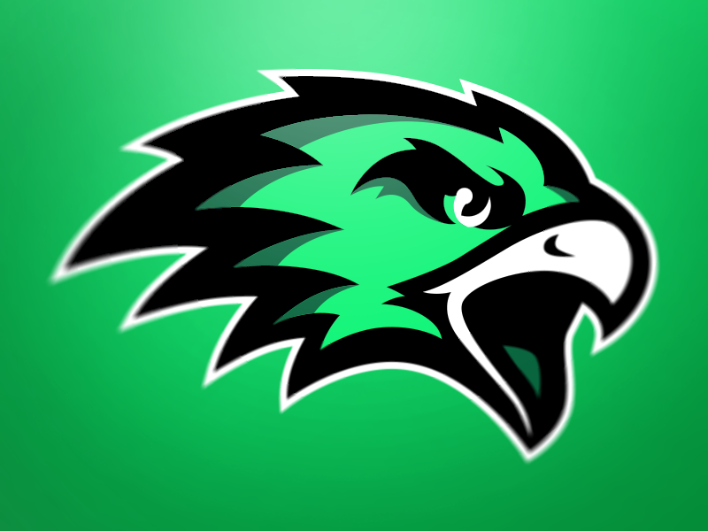
On 1/29/2016 at 6:46 PM, 77iceman said:
The more i see these "birds with teeth" logos, the more i like my super simple design...
Adam from Summit Athletics, thanks for coming here and soliciting feedback. I'll give my 2 cents though I'm not sure any of what I have to say is new or unique. Others have already responded with many of the same points.
1. As you can probably see, many UND fans think the Fighting Hawks nickname isn't a bad nickname in isolation, but being there are dozens of variations on the "Hawk" theme, in the end it's not a very unique nickname. For a fan base fiercely proud of the what was arguably considered one of the best nicknames, and best logos in sports, it's very difficult to just be driving another "color" Chevy Impala. Therefore, we really NEED a logo that will be unique and identiable. Something that will inspire pride so that fans want to wear apparel with that image.
Therefore, please stay away from the cartoonish caricatures, or the bland images so common with "hawk" related nicknames. we need something different, and IMO that means something that may be more impressionistic than realistic. Take the Iowa Hawkeye logo, for example. Or this one, above, by 77iceman. It's unique, simple, and immediately recognizable as the University of North Dakota's. of course I'm not suggesting copying 77iceman, but he provides an excellent example of the type of image I hope we end up with.
What I'd like to avoid is:


The first logo and the 3rd logo pasted above are from 2 different colleges. The last thing we need is a logo that's difficult to differentiate from anyone elses.
2. As someone else said, we don't need to intimidate with the logo. get rid of the "angry" logo. There's no good way to evoke those emotions in a logo without looking like a cartoon. We want strength, dignity and confidence, not anger.
3. IMO, the best logos are simple images that are easily recognizable, yet representative of their nickname, regardless of size. Think of the Minnesota Vikings, Dallas Cowboys, Detroit Lions, St. Louis Rams, etc.
Please, just don't give us a variation on an overused image.
-
1
-
-
On 1/29/2016 at 4:20 PM, burronation said:
Found this one on dribble that someone from Fargo did.
Hmmm, with just a little bit of work one could definitely make a transition to a hawk image that would be reminiscent of the old geometric logo:
I totally get the need to avoid making he new hawk logo look like it has Native American imagery. I also get some people's desire to have some sort of reference to UND's nickname/logo history.
So, why not reference the old geometric logo? I think a skilled artist (not me) could easily work in elements that would hearken to the past yet stay within the boundaries of what would be acceptable to the NCAA.
-
2
-
-
Your stuff is much better than the stuff from, at least, Phoenix.
They make some nice images but nothing out of the box. Just cartoony looking stuff.
-
paging through Phoenix's college branding it looks like we'll get the normal, blaise', animal image related to "fighting hawks". Nothing terribly innovative or imaginative. Just a nice bird image. bleh
SME's stuff looks better to me
It's hard to tell how much collegiate logo development Summit has done but nothing on their site looks all that exciting.
-
4 hours ago, Shawn-O said:

This is making the rounds on social media and it's very good in my opinion.
Not bad at all
-
8 hours ago, SiouxFanatic said:
I'll agree to disagree. The errant pass to the CC player who was coming down the slot in OT was also bad. Hrynkiw came up big and made the save fortunately.
OMG, was that bad. Geez.
Others have already mentioned it and I noticed it too, as little hockey as I know. I didn't see the first period, but 2nd period was all about just trying to dump the puck out of the defensive zone. Kept going to CC players in the neutral zone who would re-enter the UND zone, rinse and repeat. Seemed like very little flow...no wonder CC was generating chances and UND wasn't. It was ugly to watch.
-
1 minute ago, Cratter said:
No.
I'm not saying Matt is a bad goalie, or Cam for that matter.
I'm just saying that a healthy, by most reports, Tomek barely even get exhibition playing time seems odd.
I get that, and that's probably my first gut reaction as well. I'm just trying to look at this from the perspective the coaches, who by all accounts are smart hockey guys and have more riding on wins and losses than me. Long story short my guess is Tomek hasn't shown enough in practice to earn playing time beyond the other two guys, who have been playing well (for the most part)
-
2 minutes ago, Cratter said:
I have a hard time believing a walk on goalie is going to be better than the highest drafted goalie to play at UND in forty years.
I see your point, but did he play like a walk-on goalie in the first half of the year?
-
41 minutes ago, Cratter said:
Seems to be more than just an injury doesn't it.
Well, you've got two other goalies who have both performed very well in the first half of the season, even excellent. So Tomek is going to have to earn his way on to the ice, IMO
-
2
-
-
46 minutes ago, burd said:
Hammer and Jake must be burning one--they got the giggles.
Not sure if you heard but right before that Brandt said UND wasn't "farting around with the puck". There was an immediate long silence, and then they couldn't stop giggling and shortly they went to commercial :-)
-
1 hour ago, Oxbow6 said:
Rumor I'll be having the taco/grinder combo from the RP tonight.
JEALOUS!
-
If Schmaltz is also out it does suck from a conference title perspective but assuming these guys can all heal up for the end of the year run this could have a silver lining. Guys have an opportunity to learn how to win without all the big stars in the lineup. If they can be successful, that could make a better team later in the year
-
1
-
-
1 hour ago, The Sicatoka said:
We are coming off of one of those.
There's something to be said about someone who knows they need to keep fresh and isn't just playing out the string.
not a bad perspective
-
51 minutes ago, SIOUXFAN97 said:

I hope they do a straight on logo...two eyes a beak...a lot of black with green eyes and more geometric...
This is way too busy but something nice and simple, maybe a touch abstract could be very cool. I wish I was an artist or had some sweet skills to illustrate my point
So I Guess Fighting Hawks It Is
in UND Nickname
Posted
Well, at least you apologized