
FightingSU
-
Posts
1,031 -
Joined
-
Last visited
-
Days Won
3
Everything posted by FightingSU
-
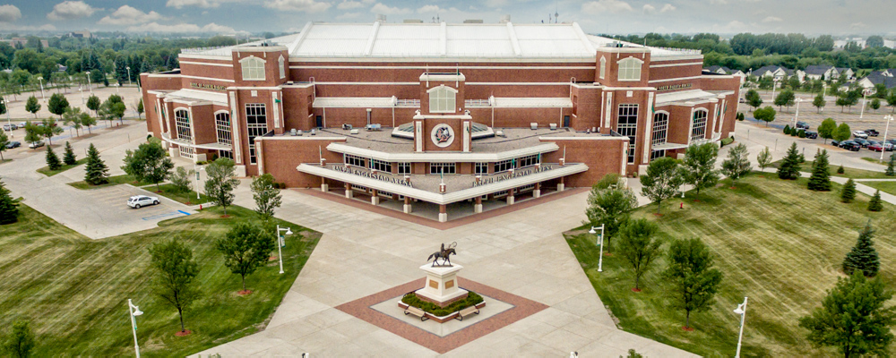
UND @ St Cloud - Redemption Game - Sat Dec 4th 2021
FightingSU replied to SiouxFan100's topic in Men's Hockey
Getting great looks tonight at least and putting up shots. Looks great tonight. Why can’t we do this for a full weekend? I won’t complain about tonight but man, what a 180 -
UND @ St Cloud - Redemption Game - Sat Dec 4th 2021
FightingSU replied to SiouxFan100's topic in Men's Hockey
Good save for Driscoll -
UND @ St Cloud - Redemption Game - Sat Dec 4th 2021
FightingSU replied to SiouxFan100's topic in Men's Hockey
Yuuuge. -
UND @ St Cloud - Redemption Game - Sat Dec 4th 2021
FightingSU replied to SiouxFan100's topic in Men's Hockey
Just Jammer -
UND @ St Cloud - Redemption Game - Sat Dec 4th 2021
FightingSU replied to SiouxFan100's topic in Men's Hockey
Beautiful backhander -
UND @ St Cloud - Redemption Game - Sat Dec 4th 2021
FightingSU replied to SiouxFan100's topic in Men's Hockey
Agreed as well. It isn’t just him and I know that but sometimes he has to be able to step up and make a save. Also it seems like he is always way outside of the net. Idk why he plays like that -
UND @ St Cloud - Redemption Game - Sat Dec 4th 2021
FightingSU replied to SiouxFan100's topic in Men's Hockey
I get a little hate every time I say Driscoll sucks. But seriously … maybe he doesn’t SUCK but he isn’t elite and shouldn’t be playing at this level. Do we have a better option right this very second? Idk. Probably not, but then that’s on Berry who I also am questionable on and then people say I am over reacting. Driscoll should be making some of these stops. We have had some AMAZING opportunities that don’t convert because of elite goalies making amazing stops and we are not able to do the same thing. -
UND @ St Cloud - Redemption Game - Sat Dec 4th 2021
FightingSU replied to SiouxFan100's topic in Men's Hockey
No. -
UND @ St Cloud - Redemption Game - Sat Dec 4th 2021
FightingSU replied to SiouxFan100's topic in Men's Hockey
There we go!!! -
UND @ St Cloud - Redemption Game - Sat Dec 4th 2021
FightingSU replied to SiouxFan100's topic in Men's Hockey
Driscoll…… -
I believe this is true as well.
-
I mean. Yeah fair enough. I know.
-
Driscoll has the worst save percentage we’ve seen in many many years. So it’s not really an opinion at this point. Is he better than me? Sure. But he doesn’t seem elite enough to be playing for UND. Also, I am definitely on team #OverReact when we lose so… I’ll take that.
-
Driscoll sucks.
-
It’s also the arena selling it…
-
These penalties have been happening all year with ZERO improvement. Really going the other direction. Something is not right.
-
No. They clearly do not.
-
Maybe he should actually discipline his players. There is no excuse to have 9 nhl draft picks on the team and lose like This.
-
This.
-
The team is just off. They are not playing ND hockey. Every team we have played looks better than us except for Denver and Niagara. We need to get more Hugh end players. Idk. Idk
-
We need a new coach and one that can recruit better. When we won in 2016 it wasn’t even with Berrys recruits. He is low energy.
-
New coach please !!
-
Watch us win tomorrow by 3.
-
New coach please.
-
We need a new coach

