
dagies
-
Posts
8,845 -
Joined
-
Last visited
-
Days Won
5
Posts posted by dagies
-
-
15 hours ago, MafiaMan said:
I'm sorry, but this hat looks AWFUL. If I wasn't a fan of the school or the team, I'd have NO CLUE what the green "letters" are supposed to be.
That might be the WORST hat ever. unreal that ever made it to the shelves.
14 hours ago, Hayduke said: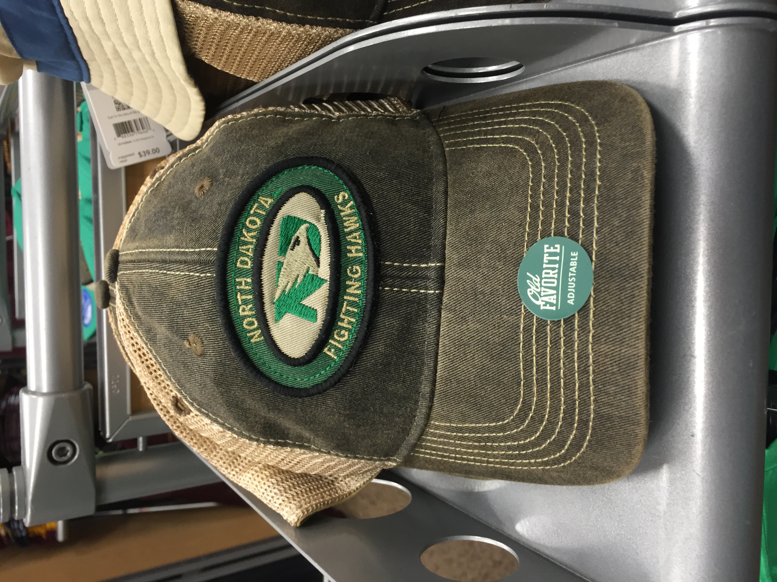
This one.... I like. I'd buy it.
Not sure I'd wear it, but it's actually not bad. Then again, i'm just not a big hat guy....
-
19 hours ago, UND1981 said:
Who would buy new merchandise if this was the FH logo?
not I
-
 1
1
-
-
On 8/13/2016 at 11:24 AM, The Sicatoka said:
OK, so let me get this straight:
Years ago John Buccigross puts out hats that say "Cawlidge Hawkey" and they are like way so cooooool.
So, seeing that, and the number of college hockey fans that scooped them up, Adidas plays off that with the new nickname and they are like way so baaaaaad?
That's clever once in an email to your friends, or a one-time tweet. And then it's just dumb. Has always grated on me.
On 8/13/2016 at 6:26 PM, Siouxperfan7 said:I wasn't there. But this was sent to me by someone who was.
Still not a huge fan of the logo but works ok on that shirt. I'd actually wear that.
-
12 hours ago, MafiaMan said:
UND HAWKEY?
GROAN...
agree. I get it, but I just don't care for it
-
2
-
-
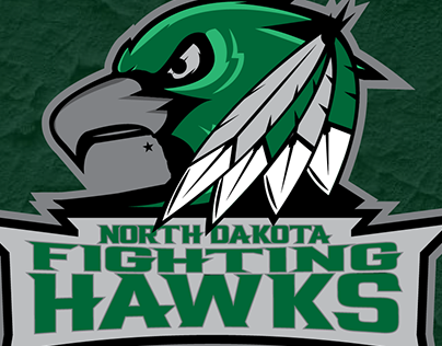
I know we're well past the point of giving input on what the logo should be or how it could be tweaked, but just for the sake of conversation, I'm thinking if the upper feathers on the hawk were upturned a bit, a little more of a ski jump to them, it might have more dramatic impact. Just a thought
-
22 hours ago, Siouxperfan7 said:
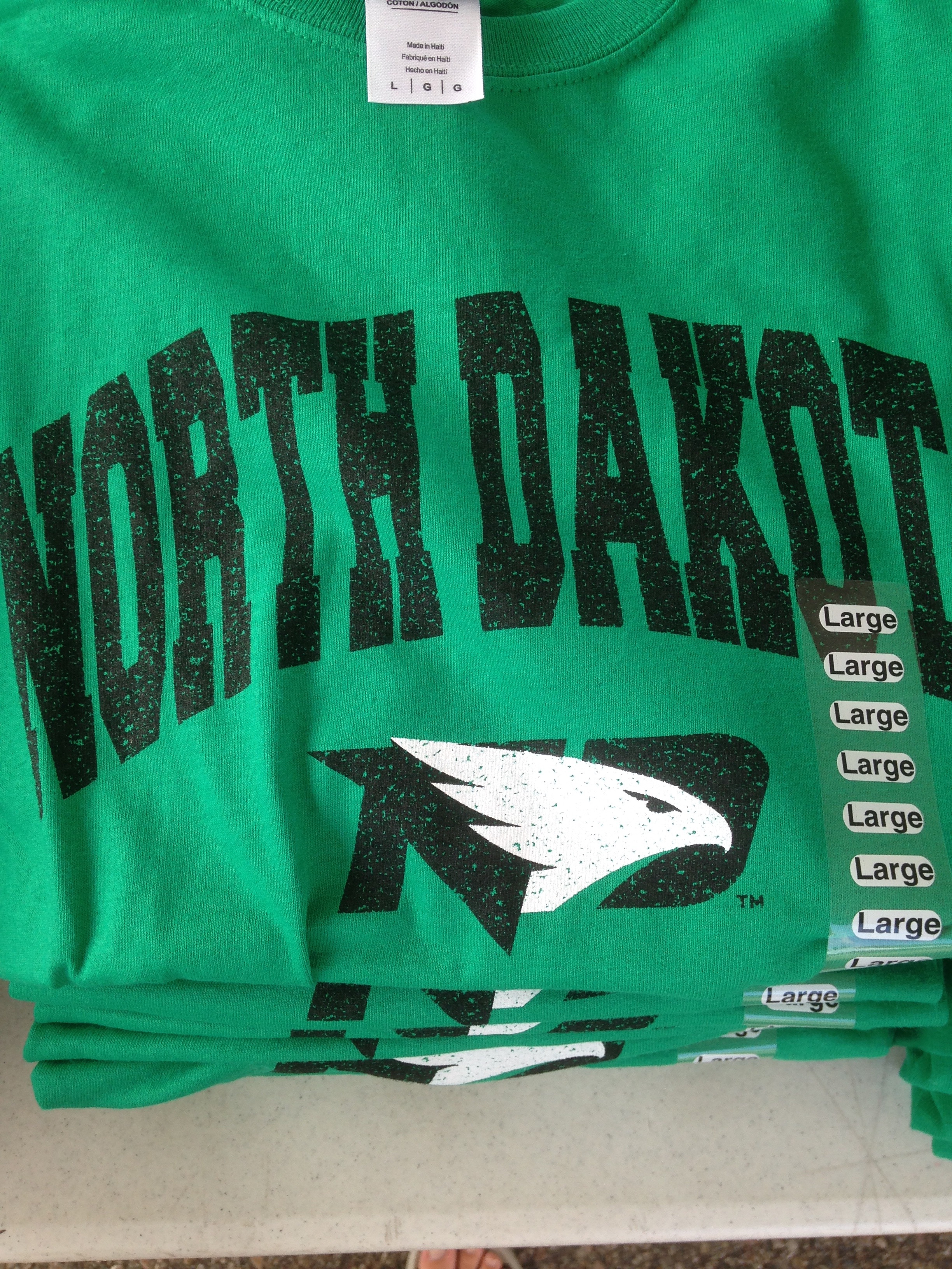
We got a sneak peak at some clothing with the new logo on it at media day. I think it looks really good. I really like the alternate logo with the black letters on the green background. 9 more days till the rest of us can get our hands on some new merch!
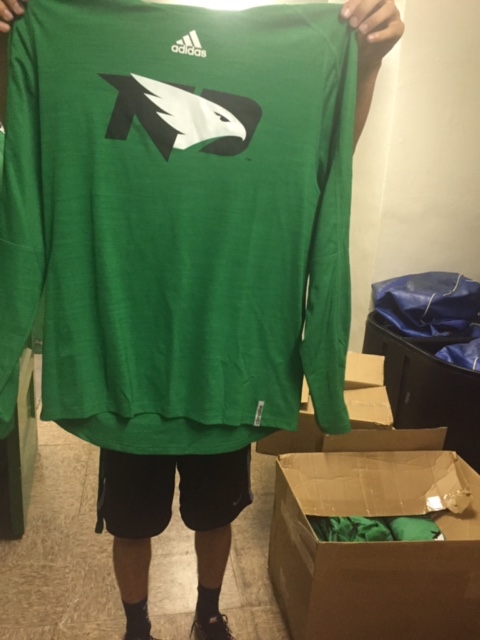
I'm on record as not being a huge fan of this logo. Not sure if it's the black letters but this doesn't look all bad. Better than I would have expected.
-
45 minutes ago, The Sicatoka said:
I wanted a UND FB helmet with just the four feathers of the Brien logo applied to the helmet so the helmet had the look of the logo. (I'm sure that would've been completely offensive as it would've been a sticker of an eagle feather.)
that would have been cool
-
So, curious, maybe more people like the hawk head incorporated in the ND as part of the logo than I think, but what are the possibilities that at some point in the future they'd pluck that hawk off the ND, and just drop that on the helmets. Would be very Arizona Cardinals-like, but already acknowledging that our nickname and logo is not all that unique, that's actually a pretty good logo/helmet.
-
1
-
-
On 7/11/2016 at 10:48 AM, SiouxVolley said:
It's not picked up by regional and national news outlets. With the Muslim immigration issue, it should be.
Just a comment about the alleged incident involving a band of Muslim's threatening law abiding citizens in Minneapolis. This was posted on our neighborhood NextDoor social networking site. I'm not going to include the name of the person who posted it to protect their privacy, and of course we can all question the legitimacy of the post. But FWIW, it does offer a possible explanation for why this was all swept under the rug:
QuoteWhen we heard this story through KSTP on July 6th and couldn't find any reference to it at all anywhere else, we contacted KSTP and this is the response we got:
"So a police report was filed on this and Minneapolis Police tell us they were investigating. About a week ago I touched base again with the victim we interviewed and she told us to take the video down. I asked why and she was very awkward about the situation. She even said “what if I made the whole thing up?”. So she could have been lying to both me and the police department. That’s the only update I have on the situation but as far as I’m concerned there haven’t been any other issues since our report. -Brett"So, while this doesn't mean it didn't happen, it sure puts a lot of doubt into the story.
-
2
-
-
They are using UND to try and fill the venue for their other games. You are welcome, UofM Hockey. If I go, though, it will be because I managed to get tickets on the street.
-
1
-
-
If I'm not looking directly at the logo my mind perceives the shape of a buffalo. To me it still doesn't look like an athletic logo. Visually it all works ok, though.
-
Oy, the new logo on the football helmets is kind of reminiscent of a buffalo (the shape, anyway). Visually, it struck me early when i wasn't focusing directly on the image. I really had to focus on the image itself to get past that. Kind of like when you don't look straight at a dim star at night you can kind of see it better.
I do applaud the football program's acclimation to the new nickname and logo. For me I just wish the logo was a bit more athletic and less corporate-y(conversations well documented in these threads so I won't go into more detail now).
-
6 hours ago, burd said:
I hope I don't get crucified for getting a little academic here.
Milton was heavily criticized for what many people thought was a overly flattering portrayal of Satan in Paradise Lost. They thought his depiction of Satan as a powerful and dangerous being was disloyal, and they questioned his christian faith as a result. Milton, however, felt that recognizing the immense power of Satan only underscored and glorified the power of God, who defeated him.
I don't have any problem recognizing the quality of the gopher program because it helps to show just how good UND is and has been over the years. And the good vs. evil thing works for me too.

Nice work!
-
Nine is Fine
-
- Popular Post
- Popular Post
1 hour ago, Teeder11 said:He looks sad. Why is he so glum? He still gets to wear the greatest nickname and logo in the history of mankind!
He just found out "making America great again!" didn't include a return of UND using the Fighting Sioux nickname.
-
5
-
On 7/18/2016 at 10:22 AM, Siouxperfan7 said:
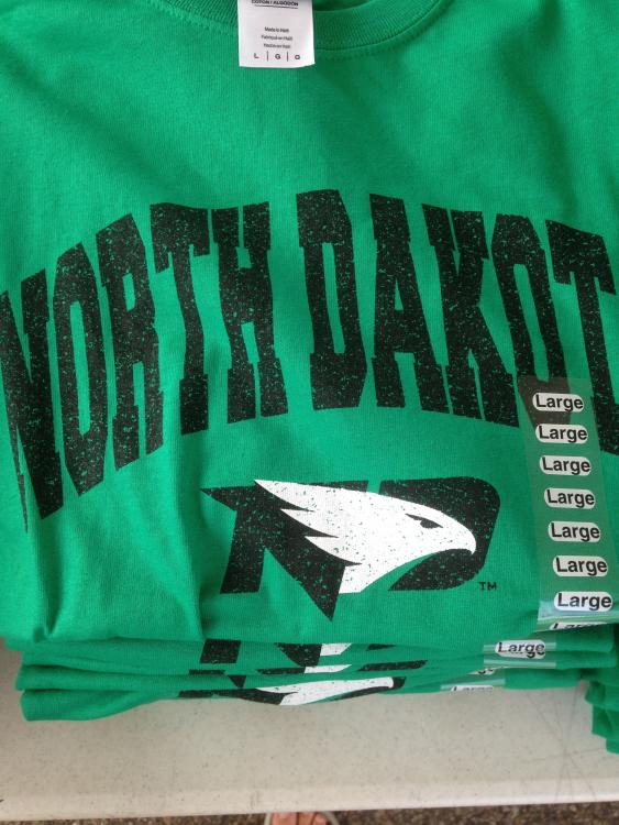
New UND Insider adapted logo. Not bad.
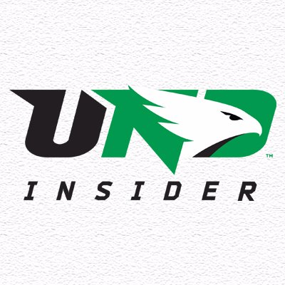
It's still a corporate looking logo to me, not so much for athletics, but it's pretty sharp.
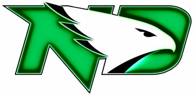
I hope one day they find a way to pull that hawk out of the ND and find a way to allow it to stand alone. Perhaps a few small, tiny details (like the black tips of the feathers someone had added earlier) might help turn that into an ok athletic logo.
-
14 hours ago, NorthDakotaHockey said:
Nothing wrong with Mankato joining the NCHC best I can tell, except that their departure will hurt the WCHA. I could never figure out folks who cry about Saint Cloud being in the league. They've a very nice arena, a reasoned array of Pizza Hut banners, a fine coach, and a solid D1 program. And it is an easy road trip for legions of fans. Mankato is not far off of these marks.
It's college hockey. Look at the programs, not at the name of the university or the city in which it is located. MSU-Mankato has a damned good coach and is in a great recruiting position. It has always been competitive with NDU. It At least nearly so. And another relatively easy road trip for many.
Frankly, these days, they'll throw a more competitive game on the ice than will most, of not all, of the patsies in the Pig10.
My three cents. Agreed. Let's douse the arrogance. After all, it's only hockey.
Amen NDH!
-
1
-
-
How fortunate were we as fans last year? I didn't get to see many games in person, and unfortunately 2 of them were the Frozen Faceoff games, but the team definitely made up for it! Heck of a year, with so many incredible plays, and overall just a good team easy to root for. AND then they bring IT home.
Hope we as fans don't take it for granted!
-
agreed
-
1
-
-
17 hours ago, UNDBIZ said:
One one hand he admits it was the NCAA that forced UND's hand, and then UND is supposed to buy back all of the Fighting Sioux merchandise? Makes no sense.
-
22 hours ago, SiouxFanatic said:
I may be in the minority but I'd be all for Mankato joining the NCHC.
I would too. I'm not all that informed about the importance of conference affiliations, I just like seeing UND play teams in the area that are easy for road trips. Some of us don't have the time for weekends away, so driving distance from the Cities is great for me. And I think teams that are close help make for intense rivalries.
-
On 7/7/2016 at 9:30 AM, 77iceman said:
I haven't seen any "non commissioned" logos that really caught my attention, anyway . . .
Was it yours? I thought it was pretty good....
-
8 hours ago, geaux_sioux said:
O look another terrible alternate logo.
agree
-
On 6/30/2016 at 8:56 AM, UND99 said:
This is a major improvement
On 6/30/2016 at 10:13 AM, The Sicatoka said:One person's plain is another person's clean and simple.
me (on the clean and simple)
22 hours ago, sprig said:Black would have made a better first impression. The one Ed wore is damn ugly. Hope none of those are in the siouxshop. They could pay me to wear one, but I'd wear it inside out.
This made me laugh out loud
5 hours ago, Cratter said:Saw on the news yesterday, a gf print shop is producing one of the logos that's been posted here.
My phone, this forum, and pasting links don't go together.
That logo is no better than the one UND rolled out, IMO

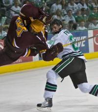
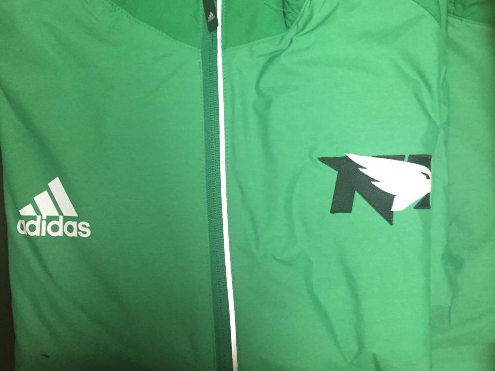
Here comes the Merchandise
in UND Nickname
Posted
Probably not!