
sethhag
-
Posts
30 -
Joined
-
Last visited
Posts posted by sethhag
-
-
3 hours ago, chicofelipe said:
Did you wrestle a greased pig before doing this? That arm is as filthy as a Brock Boesser one-timer.
not too sure on that, currently washing arms and hands every hour on the hour just to be sure tho
-
 1
1
-
-
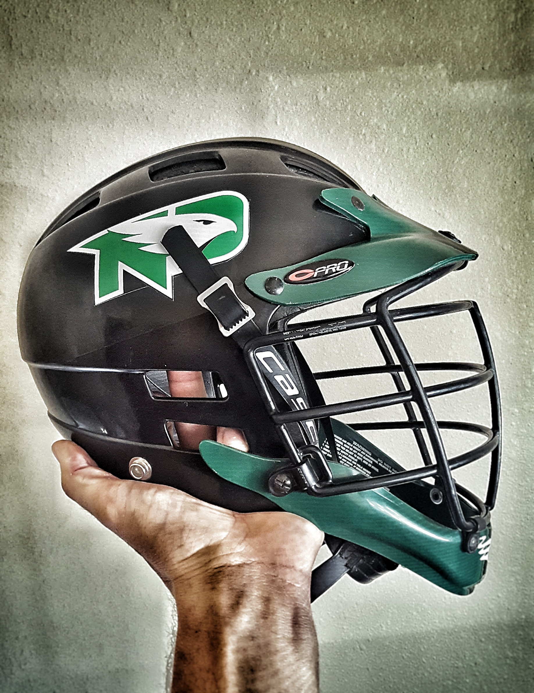
just threw a hawks sticker on my old UND college lacrosse helmet to see what the logo looks like on a black helmet. i think it really pops IMO, i think the hockey/football teams are missing out by not putting this on a black helmet.

-
 1
1
-
-
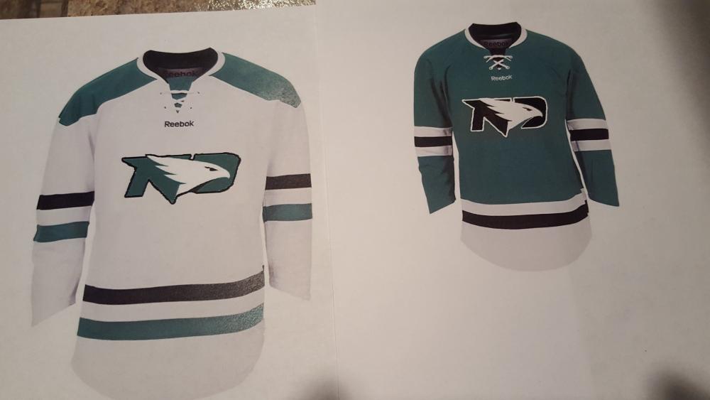
did this real quick jersey mock up one day bored at work, I'm not very artistic, or good with Photoshop or Paint. I do think keeping the words of the front looks better/cleaner. I was thinking maybe the words could be moved to the shoulder or sleeve area if made small enough. also this is my first post to this community after spending years just dropping by and reading. I am a 2009 UND grad, and have had family season hockey tickets since 2002
-
2
-
What do you think of the logo now??
in UND Nickname
Posted · Edited by sethhag
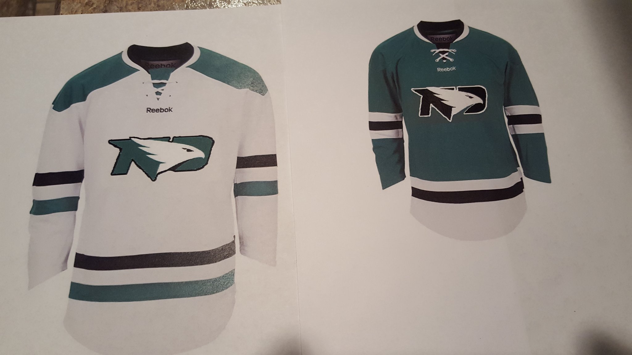
adding to the idea
super quick renderings I had made up when the logo first debuted, I think adding something to the shoulder would complete the look, North on 1, Dakota on the other