
sethhag
-
Posts
30 -
Joined
-
Last visited
Posts posted by sethhag
-
-
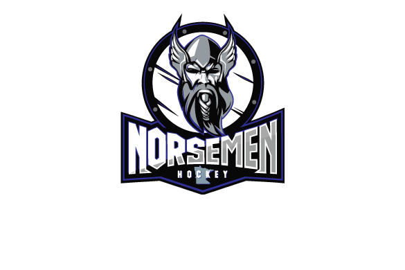
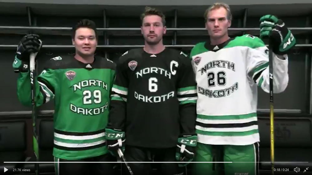
The former Brookings Blizzard of the NAHL are now the St. Cloud Norsemen...what do we think of this logo, as i remember that Norsemen was one of the name options that was higher up on the board.
-
 2
2
-
-
11 hours ago, Frozen4sioux said:
Bet he wishes rocco was still around......
.......I'll see myself out.
this was gold, and needs to be recognized as such
-
-
On 1/4/2020 at 1:18 PM, WiSioux said:
Sightlines will be terrible at a baseball stadium.
according the article I read on the Athletic website it says this about sightlines and seating.... "Normally when NHL outdoor games take place at baseball stadiums, the rink sits from third base to first base horizontally covering second base starting above the pitcher’s mound. But this will be the 11th outdoor game played at a baseball stadium. The NHL is considering changing the rink configuration up next year and that could lead to auxiliary seating in the outfield. Target Field also has the ability to do a lot of standing-room only spots, so it’s up in the air how much they’ll be able to sell.
hopefully this will add more seats with more of a traditional hockey view...who knows
-
20 hours ago, Cratter said:
Time for UND to introduce a whole new alternative outfit including helmets and gloves.
The new special occasion blacks if you will.
Let the players design it. Bust them out for frozen four games.
a steel Grey (gray?) set would be cool to see, football uniforms with that color are pretty cool and pop with the Kelly green
-
11 hours ago, Siouxperfan7 said:
So the outcry to have secondary logo started probably 2 minutes after the logo was announced. I was in the camp of not doing that immediately so that UND could work on it's brand identity and have just one logo. A secondary logo is likely going to happen. I propose they don't make something totally new but just tweak the current logo. The Hawk head in the ND is a unique look and I think it works. But maybe UND could utilize just the Hawk head with a green or black (even grey) background without the "ND" as a background. I especially think this type of logo would look great on the football helmets as you could have the hawk on both sides of the helmet facing forward. Just a thought.
have always been a fan of simply removing the "ND" from the logo, even used the hawk head only on some of the jersey designs I threw out in the jersey thread. this is a very good design, makes it look neat and concise.
-
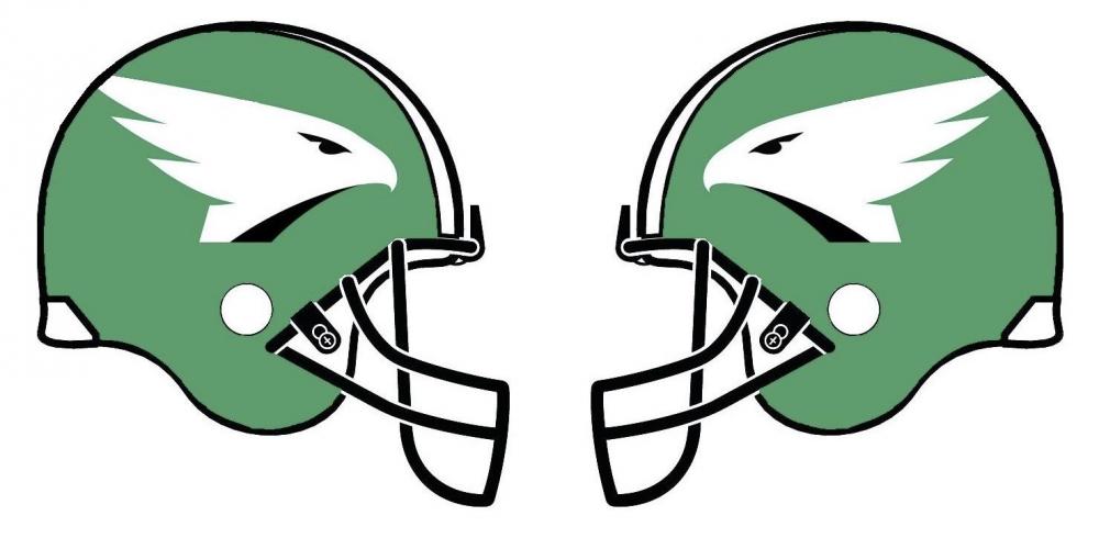
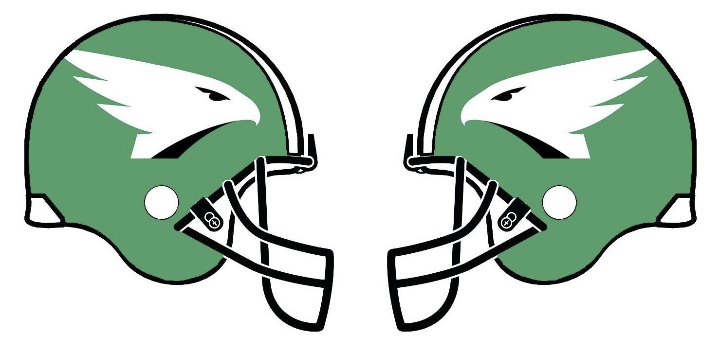
3 hours ago, Siouxperfan7 said:
OK, I am calling BS on this. There is no way anyone would mistake these two logos for each other. Not even close.
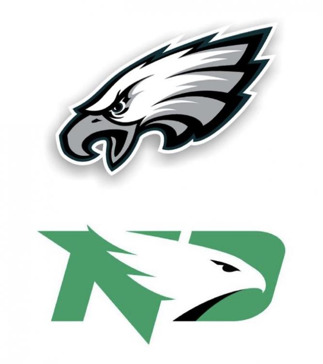
I think its not close either, however the one factor we are not taking into account is the intelligence, or lack thereof, of most fans of teams from Philadelphia
-
4
-
-
19 hours ago, Emerald joker said:
i was wondering looking at this picture, is the score board going to obstruct the view for the upper seats, will they be able to see across the ice?
as long as the 300 level fans can see both goals and the benches I think its fine, not being able to see other sections across the rink is probably not the ralphs biggest concern
-
17 hours ago, CarpeRemote said:
If you were King of Hockey, what would you change, impose, or otherwise decree to make REA the best fan experience in the college hockey kingdom? (Other than winning of course)
that's easy, less Ad runs, more music, less of that weird guy on the mic giving away something, more of him leading crowd chants.....the king has spoken
-
 1
1
-
-
22 hours ago, siouxforcefans said:
IMHO, Simba cam is waaay better received than the tired old kiss cam, at least in my section. Your section may feel differently. My point is, if you trot out all the same old stuff, it gets stale. Even with how much better the race animation has been the last couple years, the Steamatic race still takes too long and only involves 3 sections out of 32 (plus suites).
kiss cam is probably too problematic in todays day and age haha.
as far as my criticism of the simba cam, I has more to do with taking peoples attention away from the game on the ice, then the cam itself, I think its a fun thing.
-
1 hour ago, CarpeRemote said:
Glad to hear you change it up and good point on the age of the players.
An observation and a couple questions:
I’ve found the insanely loud and constant music like we hear in several arenas is not only painful but has the unintended consequence of taking out the crowd by shutting down all spontaneous cheers/chants.
Season ticket holders and regulars at Nationwide wear earplugs and would like to catch the DJ alone
") .
.
When the music starts everyone sits down.
To be fair I haven’t been to a UND game in 4 yrs but I feel fortunate to get a DJ’s opinion: what do you think about recorded music vs a college band? What would happen with the crowd and atmosphere if recorded music (except for warm ups and limited situations) wasn’t used at UND?
TIA for a response
I've found loud music to be a common complaint I get. fist off it depends on the acoustics of the rink, and the quality of the sound system. so most standard rinks blasting music, sounds awful and does hurt the ears. Minot has just recently built a new rink with a great sound system so it has gotten better, however I've noticed that going louder at warm-ups is fine as people are still getting settled. I do however use a trick for volume during the game, I generally keep the music lower in the 1st period, then increase it a bit in the 2nd, and if its a close game I will increase it more in the 3rd. by the time the 3rd period comes around you have basically got peoples ears to adapt and they don't notice the volume icrease, and if its an intense game they actually cheer louder with the music I play and it creates atmosphere.
as far as live band vs. recorded music. I have been a season ticket holder at UND since 2001 (thanks pops) I've noticed the atmosphere in the ralph slowly start to resemble a funeral at times, and it has everything to do with the lack of recorded popular music, they play waaaayyyy to many adds (gotta pay bills I guess) and do too many special things (looking at you simba cam) that basically take away from the atmosphere IMO (I know this may be an unpopular opinion) I like the live band at the games, I think a little less of them, a little less of the extras, and a little more pump up music is the right recipe
-
3
-
-
On 8/7/2019 at 1:23 PM, Godsmack said:
The powers that be probably wouldn’t let me play DJ.....there’d be a plethora of Godsmack, Ratt, Metallica, Disturbed, etc.
I am the DJ/Announcer for the NAHL team in Minot, ND (we've had a few guys go NCHC...looking at you Jon Lizotte). I used to get people bitching to me about the music (songs and Volume) ALL the time. while it is IMPOSSIBE to please everybody, last year I adopted a system that actually worked, 1 country song - 1 hip-hop/rap song - 1 older rock song - 1 new rock song then repeated that order most of the game. I of course used some song situationally to pump people up, or make them laugh. I however ALWAYS let the players pick the warm-up song list no matter what, its their time to get in the zone and get going. while it was a few EDM type songs they actually would throw in a few surprises.
also another thing to think about is the age of these players, most of these kids were like 3 or 4 years old the last time godsmack was popular....they might not even know who they are haha
-
2
-
-
14 hours ago, SWSiouxMN said:
Took a screenshot, does this help?
Green jerseys stripes are a bit too busy for me, otherwise these are all slight upgrades from last year.... now to get rid of the dumb numbers on the front....I guess we all can't have cake and eat it too
-
1 hour ago, Sioux>Bison said:
Man that hurts my eyes. Not blaming you our logo just sucks. I think many people would move on if it wasn’t for that travesty..... for the record I do own and wear hawks hats and constantly get comments saying go eagles ...... facepalm
I have gear with both the old and new logos, I say go Hawks all the time, but the logo, in design, does not show well, it's too wide, and much too simple. while it looks great on letter head and in more formal settings, when it comes to sports and passion it falls short in inspiration
-
2
-
1
-
-
Last design I have as I think I am all out of ideas....black business suits
-
5 minutes ago, Frozen4sioux said:
I’m sure there are uglier jersey concepts on the planet,.....I’ve never seen one, but the law of averages say that there has to be something worse.
but, maybe not.
thanks! I am doing my best...glad someone noticed
(checking to see if there is a sarcasm font setting on my keyboard)
-
2
-
-
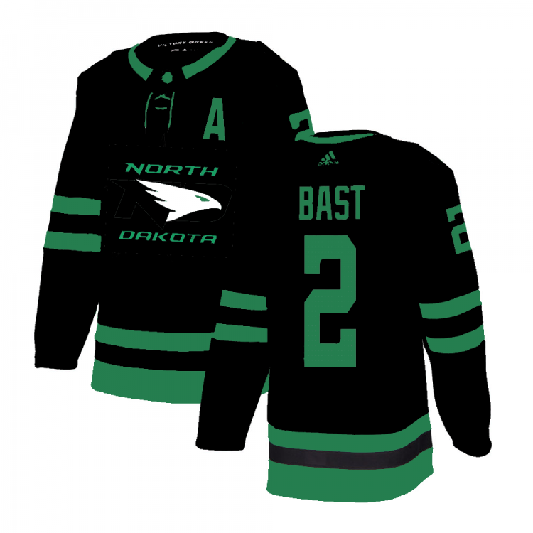
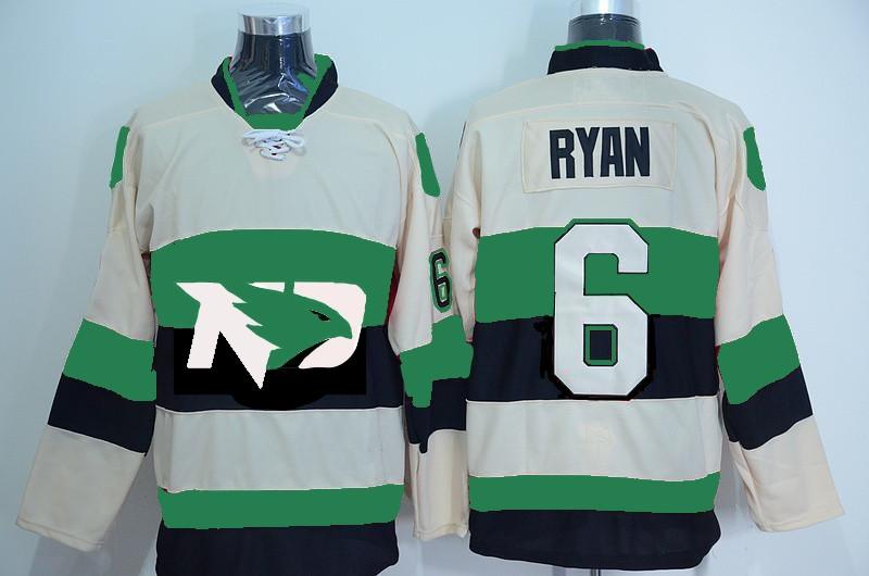
19 minutes ago, The Sicatoka said:
1. The Hawk is ALWAYS white. Every presentation. ANY presentation. The Hawk is always white.
2. I'd rather see the horizontal bands narrower than the logo.agree, the more I use the logo...the more I realize how hard it is to incorporate into a pleasing design on the front
-
27 minutes ago, The Sicatoka said:
I can't do the whole Ottawa thing, but putting the logo on a horizontal stripe might make it work on the chest.
I think you are right on this, also I have had a lot of free time at work, that why I have been able to make a bunch of these mock ups, and ignore the player name please, it was the best example I could find....sorry
-
22 hours ago, nodak651 said:
Yeah but she can threaten to cry to the press and never donate again.
I think something like this could work with the just the logo and no text.

-
7 minutes ago, sethhag said:
new attempt, road jersey
Added some shoulder color to this one

-
1
-
3
-
-
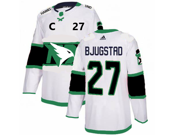
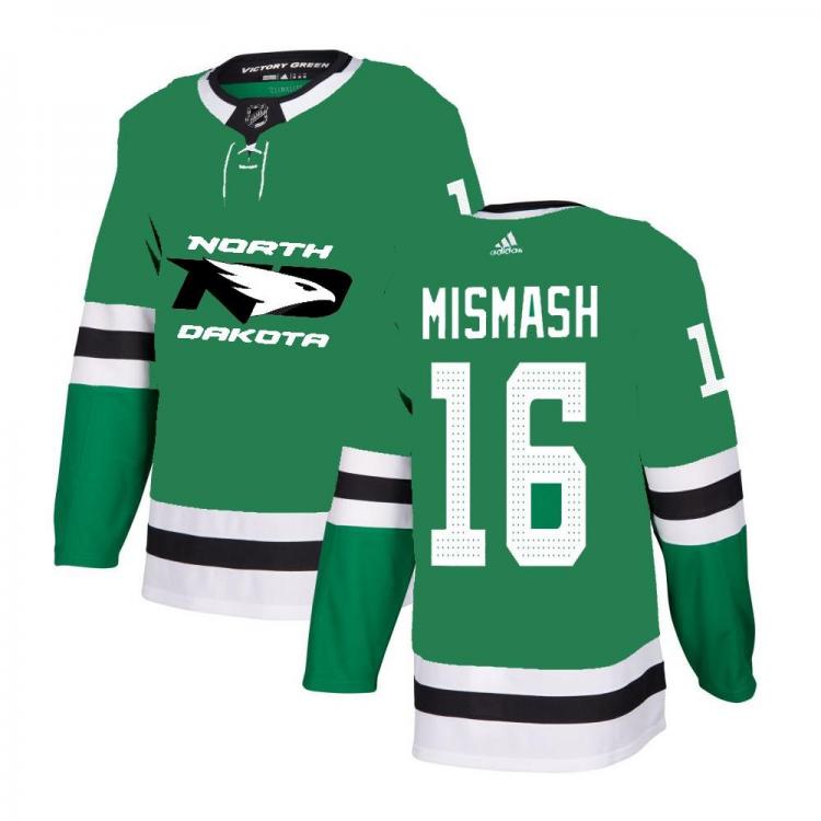
2 hours ago, streetsahead said:
Yeah I remember seeing these. These would take some getting used to but they would be a clean look.
While you're at it, let's see what it would look like using the Wild template (green jersey, wide white stripe with logo).
new attempt, road jersey
-
1
-
 1
1
-
-
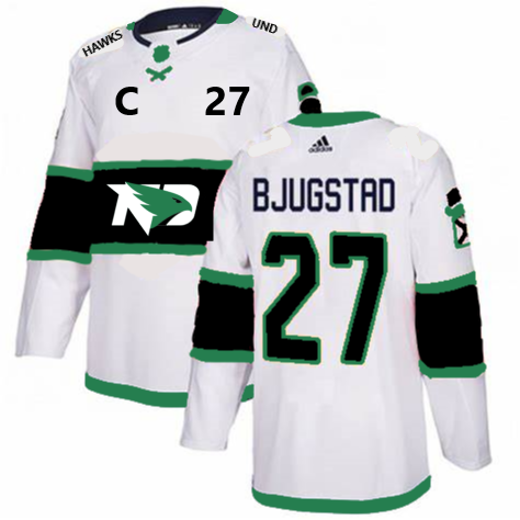
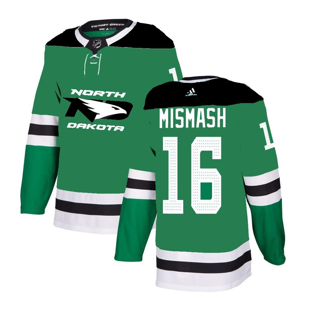
2 hours ago, streetsahead said:
That could actually work. I think part of the problem with it as a crest in the middle is that is wider than it is long and it just looks kinda weird. Having it part of a horizontal stripe would fix that somewhat. Or perhaps it could be put in a circle or something.
I've posted this before, made the mock ups a while back. I think the logo would also work if you drop the ND letters off the front, move the letters to the shoulders, and just keep the Hawk Head on the front (change the head to the color green on the white jersey) I am working on update these to the new Adidas jersey, using Dallas as a template, will post when finished
![IMG_20170724_141349[2088].jpg](https://forum.siouxsports.com/uploads/monthly_2019_04/545685359_IMG_20170724_1413492088.thumb.jpg.b075914432e78b95786503680d08a73a.jpg)
-
1
-
-
3 hours ago, geaux_sioux said:
Someone said, “you played for the fighting hawks...”
that was me...he promptly blocked me from viewing his profile. never thought I'd see a softer move from a UND hockey player, but this team still finds ways to surprise me, so kudos to them I guess
-
1
-
-
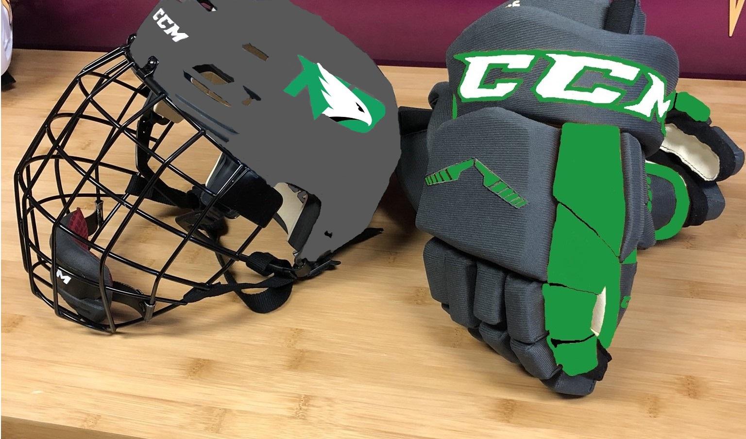
also worked on some grey (gray?) and black concepts with inspiration from some of the new football uniforms. I'm definitely no graphic designer, so they aren't very good quality, just something to jump off from for someone more talented

-
1
-


![IMG_20170724_141349[2088].jpg](https://forum.siouxsports.com/uploads/monthly_2019_04/440729442_IMG_20170724_1413492088.jpg.1dc66656d249f3e1ca9e98c373574b45.jpg)
Nashville
in Men's Hockey
Posted
these things are the definition of HAWT Garbage, my men's league team has better sweaters