
undpurp
-
Posts
7 -
Joined
-
Last visited
Posts posted by undpurp
-
-
1 minute ago, Siouxperfan7 said:
I see your point. Maybe they should go even further and do the same design as the basketball team and put numbers below the "North Dakota". I wonder how this design would look on a hockey jersey....
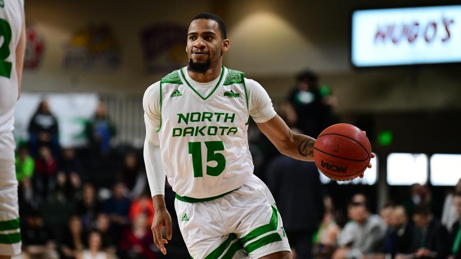
Probably similar to all the other college hockey programs that put their university's location over a number. (Denver, Miami, Omaha just in our own conference alone)
-
11 minutes ago, Siouxperfan7 said:
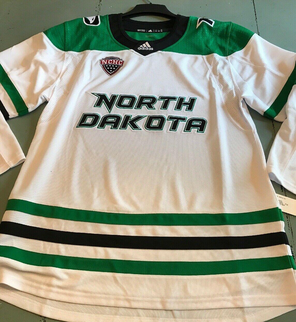
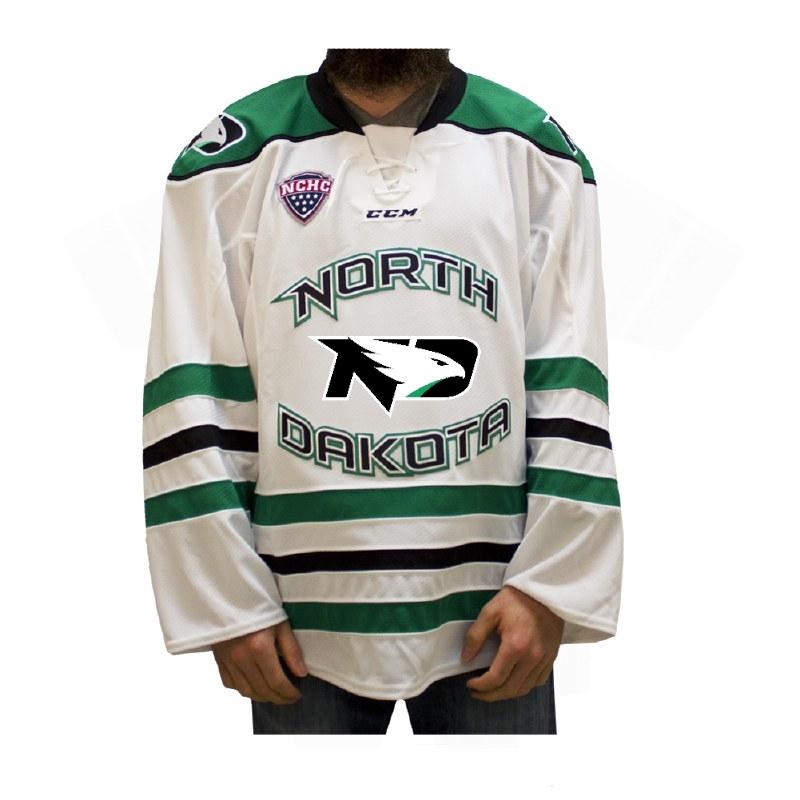
I really find it unfortunate the the REA and the hockey program has adopted the "North Dakota" script as their defacto "logo". I don't care how much you may hate the Fighting Hawks logo, buut having that logo on the front of the jersey would be waaaaaaaaay better than this!!! Yikes, this is bad.
It's the same script logo that is used on the uniforms for men's and women's basketball, softball and the track teams. If anything, changing from the circular script to this one puts these jerseys more in line with the rest of the athletic department.
-
5 minutes ago, UNDBIZ said:
It's a $64 jersey on Ebay. Are we actually thinking this is what the team is going with?
Don't know, but it doesn't jump out to me as obviously counterfeit.
-
8 hours ago, Blackheart said:
Christ is that horrible looking! There is just no pop or sizzle to this sweater. #fugly
I thought the same thing when I first saw it, but it's grown on me a bit the more I look at it.
-
A preview of the new jersey design? From a listing on ebay that sold this morning.

-
 1
1
-
-

Jerseys
in Men's Hockey
Posted
@Siouxperfan7 I do get what you're saying though, and I also wish the new logo was supported more at/by the Ralph.