Thanks for checking out the designs and the whole presentation is available at UND REBRAND PRESENTATION.
More back story: We worked independently on this major re-brand all last Summer and Fall as part of a project to come up with concepts and strategies for transitioning teams around America with Native American nicknames. In the sports design world this is a huge issue, made even harder by the battle lines that are drawn by both sides. Another such battle we were following was also occurring at Watertown High in (MA) last June.
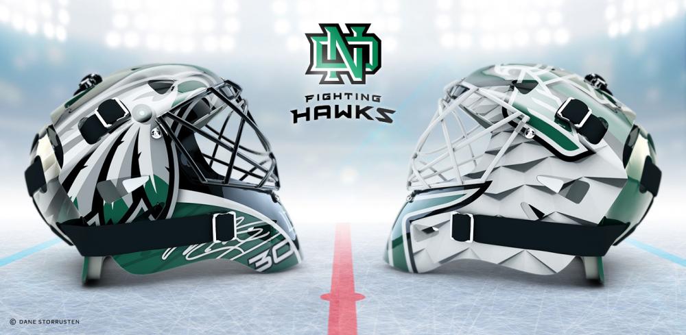
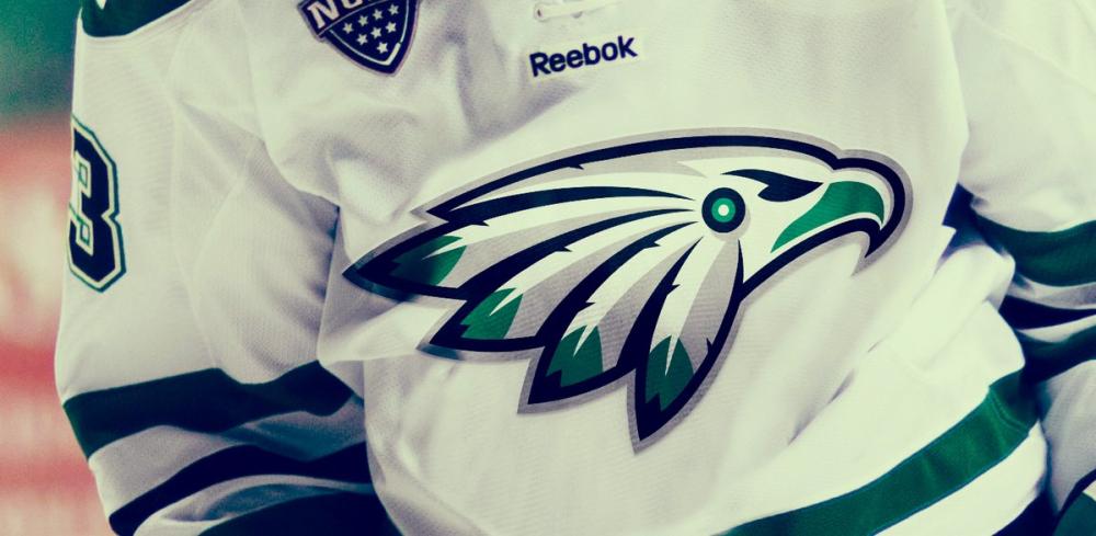
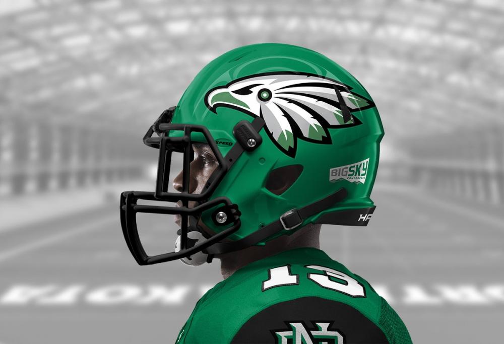
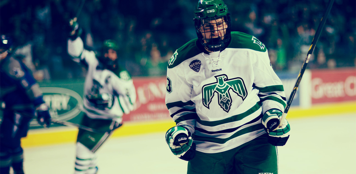
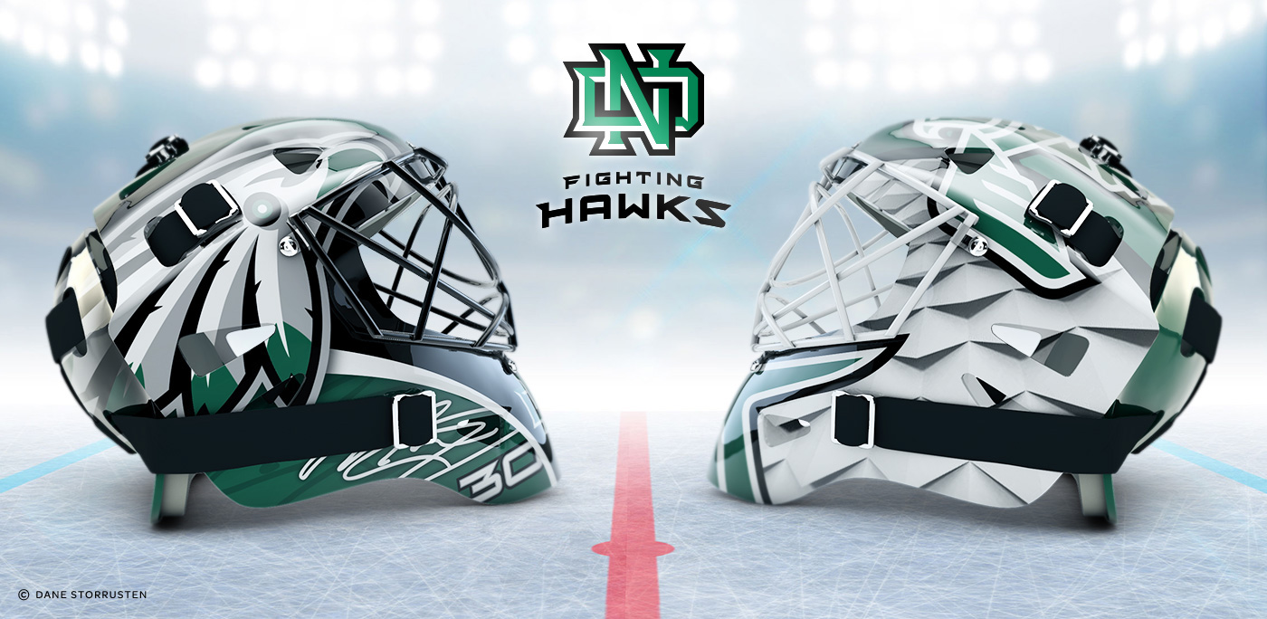
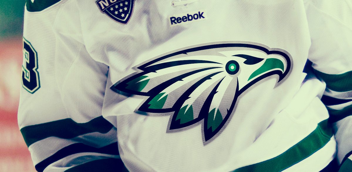
The designs that we released today are totally free of design by committee compromises that would water down a true "transition brand" direction, which is needed to appeal to the most number of fans in the UND Community, create a wide adoption and set the brand up for a successful future. To that end, we purposely nuanced the back feathers of the revered Native American hawk symbol to create an identity that would serve as a source of pride for those on all sides of the issue. Our 2nd "Thunderbird" design does this in a slightly different way. We were also keenly aware that the only way to break through the deep passion for the Fighting Sioux nickname, is a with a powerful brand identity that respects the past with elements that tie the new brand to the old.
For those wondering, definitely, we have no affiliation with other designers. Just wanted to put solid design concepts out there and let fans weigh in.


")